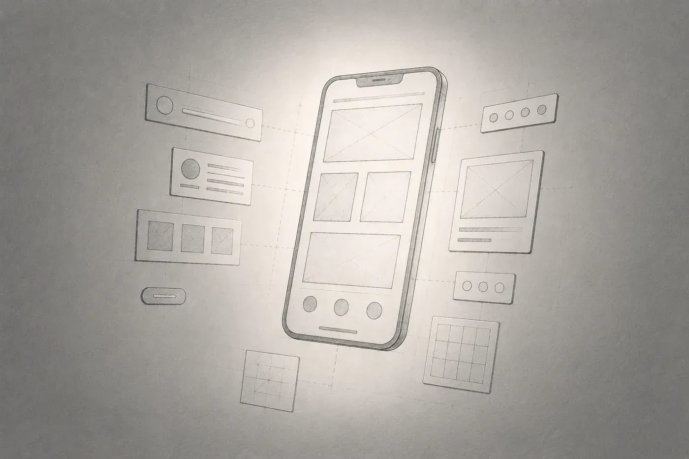
Introduction
Since joining the company, I have continued to design based on web screens. When I was assigned to the Bizend project, I continued web screen design based on the Bizend design system, and over the course of more than a year, a web-centric sensibility naturally developed. I learned how much whitespace is needed to breathe, what font size is readable, and where buttons should be placed to be easily accessed…
Then, with the new launch of the Banjangnote mobile app project, I was thankfully assigned as the designer. When I faced the mobile platform after getting used to the Bizend components, it wasn't just a matter of the screen being smaller. I organized the moments where I felt that web and mobile are actually different while comparing the two platforms.
Font
Before starting serious screen work, I first organized design tokens and typography. For web work, I used 12px for body text, but for Banjangnote mobile work, I set 13px as the minimum size, excluding labels and chips.
At first glance, it seems strange. Smartphones are closer to our eyes at a distance of 30–40cm than monitors (50–70cm). Wouldn't it be easier to see up close?
In principle, that's correct. However, the reason text appears smaller on mobile is due to the resolution. One pixel on a monitor and one pixel on a smartphone have different physical sizes. Smartphones have smaller screens but extremely high resolutions, so one pixel occupies a much smaller area in reality. This means that even if the pixel count is the same, it renders as a much smaller dot on mobile. To correct for this, mobile uses sp (Android) and pt (iOS) units to automatically scale according to device resolution.
According to guidelines, the iOS Human Interface Guidelines recommend a minimum of 17pt, and Android Material Design recommends a minimum of 12sp, while in practice, body text often uses 14–16sp. Platform guidelines are just minimums, and if the actual target age group is higher, the criteria should be raised. In other words, the guidelines should start from who is reading.
Safe Area
When designing web screens, the baseline for layout is the browser viewport. While it may vary based on scrolling or screen size, the basic principle is to place content within the viewport area.
Mobile devices do not allow the entire screen area to be used just because there is a screen. Areas like the notch, dynamic island, status bar, and home indicator are parts that designers cannot directly control. These are spaces taken up by the system, and if content is placed here, it becomes hidden or unresponsive. Areas that should be avoided when placing content are referred to as the Safe Area, and this must be considered in mobile design.
Designers need to secure the Status Bar and Home Indicator areas when designing mobile screens. Particularly when designing a fixed footer button, ignoring the home indicator area can cause the button to overlap with the indicator or become cut off, leading to usability issues on actual devices. While a web perspective allows content to be placed within the viewport, mobile requires a mindset shift to placing content within the Safe Area.
In actual work, I clearly established rules regarding this. For detail pages with no bottom navigation bar, I fixed the bottom Safe Area to 48px and used this as the basis for placing content and buttons above it.
Mobile devices vary in notch size, home indicator height, and other environmental factors among manufacturers and models. Instead of working exactly to fit each device, starting with a generously defined Safe Area is a method to safely accommodate various environments.
Navigation location
On the web, the Global Navigation Bar (GNB) is typically located at the top, while the Local Navigation Bar (LNB) is found on the left sidebar. This has been a long-standing pattern that users take for granted.
However, mobile apps are different. Since they are primarily operated with the thumb, the main menu is placed at the bottom of the screen, which is referred to as Bottom Navigation. The area that the thumb naturally reaches when holding a smartphone with one hand is at the bottom of the screen. Conversely, the top corners are the hardest areas to reach when using one hand.
If frequently used navigation is placed at the top, users have to move their hand or adjust their grip on the phone each time. This concept is known as the Thumb Zone, and it significantly impacts overall mobile UX layout. It is common to place frequently used actions at the bottom and less important information at the top. Fixing the CTA button at the bottom of the screen is for the same reason. Applying the top-centered navigation pattern from the web directly to mobile can reduce usability. One must always consider that the physical ways users interact differ across platforms.
Hover
Hover is an essential element that needs to be worked on when designing web screens. When the mouse hovers over a button, its color changes, when it hovers over a link, an underline appears, and when it hovers over a card, the shadow deepens; this is the easiest way to convey to users that they can click here.
However, since mobile environments do not have a mouse cursor, there is no hover. The moment you touch with a finger, it transitions directly to a pressed state, leaving no time for hover to occur. Mobile expresses interactive elements in other ways.
-
Pressed state: Feedback through background color or opacity change when touched
-
Ripple effect (Android): Visual feedback that spreads out from the point of touch
-
Haptic Feedback: Physically notifying the touch through vibrations
Things that were solved with hover on the web must be translated into a different interaction language on mobile. Furthermore, since there is no hover, it is essential to clearly show with the UI that this is a tappable element. Visualizing tappable areas with background colors or borders, or pairing text labels with icons instead of using icons alone, is one of the methods.
Flow of Information
Web screens are wide. Using 2-column or 3-column layouts can contain a significant amount of information on one screen. For example, information can be spread out horizontally by adding a detail panel next to a table.
Mobile is long vertically and narrow horizontally, with no room to spread out sideways. Therefore, information on mobile is designed with depth. It follows a structure going deeper like a list screen → detail screen → detailed settings screen. What was displayed in one screen on the web can be divided into 2-3 steps on mobile.
Since the amount of information that can fit on one screen is limited, prioritizing what to show first and what to hide becomes much more important. While it was a matter of layout on the web, on mobile, the significant question becomes what to show first.
However, if information is divided too finely, the depth increases, making it easy for users to lose track of their current position. This is why it is generally recommended to design within 3 depths. While dividing information, the ability to design structures that ensure users do not get lost is also an important sense in mobile design.
Button Position
On the web, buttons are mostly integrated into the flow of the content. When filling out a form, the submit button is usually at the bottom, or there’s an edit button next to a title area that requires action. As the page scrolls, the buttons move up with it, and most buttons remain visible without being hidden.
On mobile, different patterns often emerge.
-
Fixed Footer Button: A CTA button fixed at the very bottom of the screen, always in the same spot regardless of scrolling. This allows the user easy access to the main actions no matter where they are looking.
-
Floating Action Button (FAB): A round button that floats over the screen. It overlaps content and is always visible.
These patterns can be used on the web as well, but they tend to operate much more naturally on mobile. This is connected to the previously mentioned Thumb Zone; the fixed buttons are positioned where the thumb can easily reach them.
In practice, the decision of whether to fix this button or place it in the content flow is a repetitive one that arises with each screen. If the content is short, a fixed button can actually feel awkward, while longer scrolls benefit from having a fixed button for usability. For screens with long scrolls like a detailed job posting, the button is fixed at the bottom, whereas shorter content screens utilize buttons within the flow.
One more consideration was the risk level of the buttons. Buttons that could cause problems when pressed accidentally or are in a narrow space were deliberately placed away from the Thumb Zone, and designed to require an extra step through a more button (more) to prevent errors.
Conclusion
We have examined the differences between web and mobile, and ultimately, the two platforms have quite different mindsets. If the web is about how to arrange space, mobile is closer to a question of what to choose.
When the platform changes, the physical operation methods of the user, the way information is consumed, and the distance from which the screen is viewed also change. If one does not understand these differences, they will simply carry over patterns that worked well on the web. This work made me directly realize that when changing platforms, one must also change their perspective.
References
eykim