React is an open-source JavaScript library used for creating user interfaces.
There are various React-based UI libraries that help in building beautiful user interfaces. Some of the most popular ones include Material-UI, Semantic-UI-React, Ant-Design, React-Bootstrap, and Grommet, which I’ll briefly introduce here.
1. Material-UI
https://material-ui.com/?ref=designrevision.com
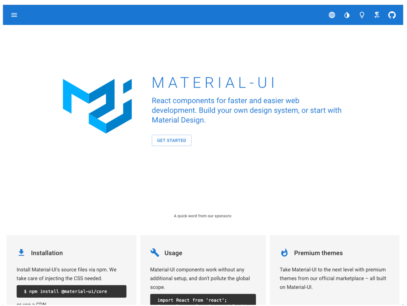
Material-UI provides React components that use Google Material Design. It offers React themes and templates, allowing you to create custom themes for your applications.
2. Semantic-UI-React
https://react.semantic-ui.com/?ref=designrevision.com
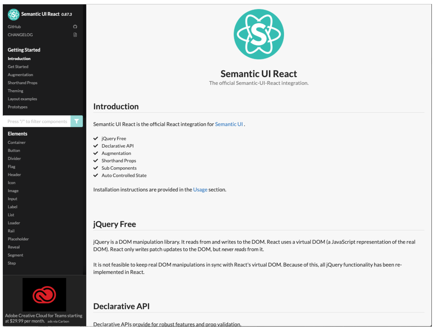
Semantic UI React is the React implementation of the Semantic UI kit. It’s jQuery-free and provides a declarative API. You can load the Semantic UI CSS theme on top of a Semantic UI React app, allowing full access to the markup to customize components.
3. Ant-Design
https://ant.design/docs/react/introduce?ref=designrevision.com
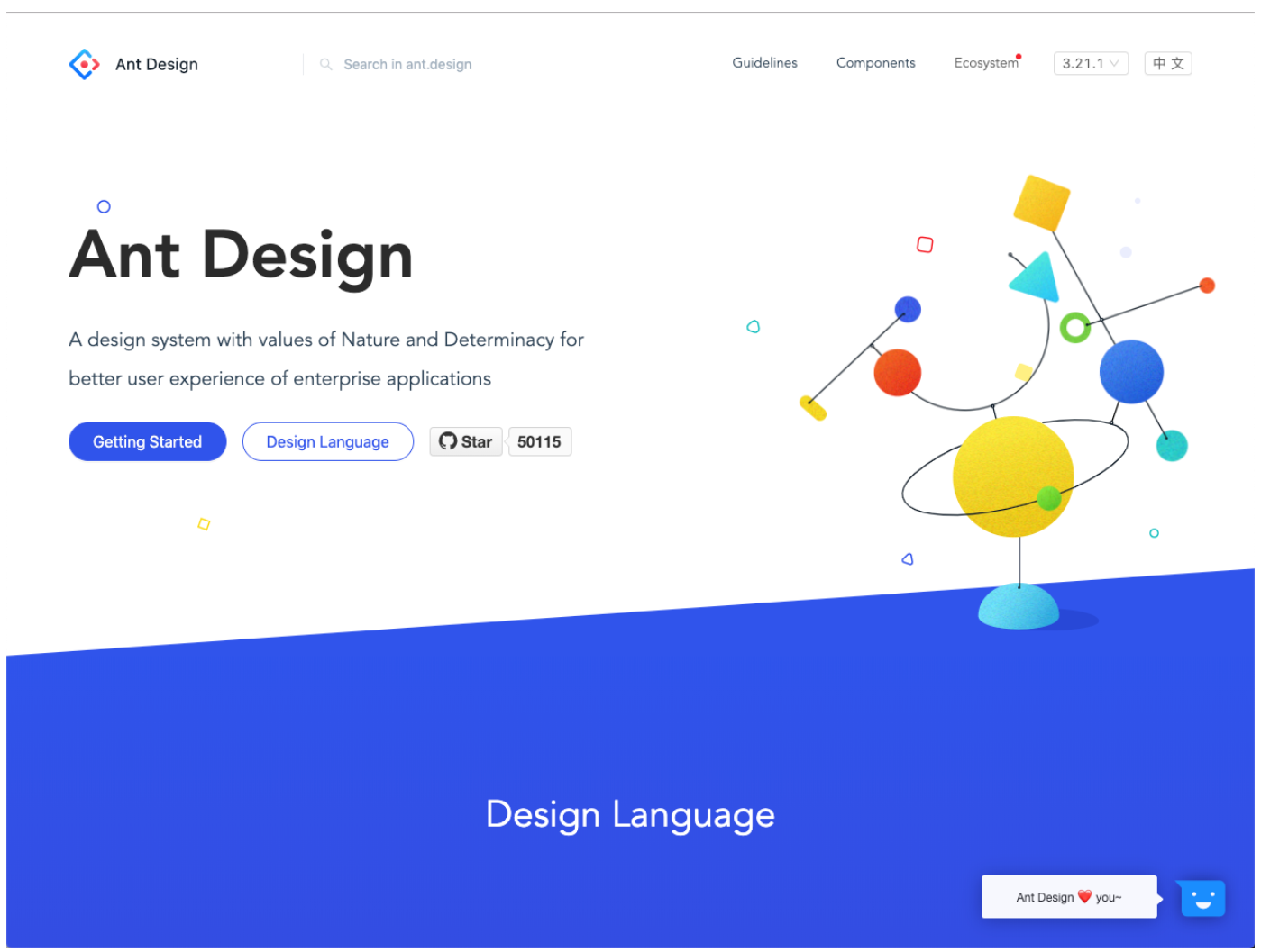
Ant Design React is an enterprise-level UI design language for web applications that features a high-quality set of React components. It offers endless possibilities for data visualization solutions and is used by companies like Alibaba, Baidu, and Ant Financial, following realistic design principles.
4. React Bootstrap
https://react-bootstrap.github.io/?ref=designrevision.com
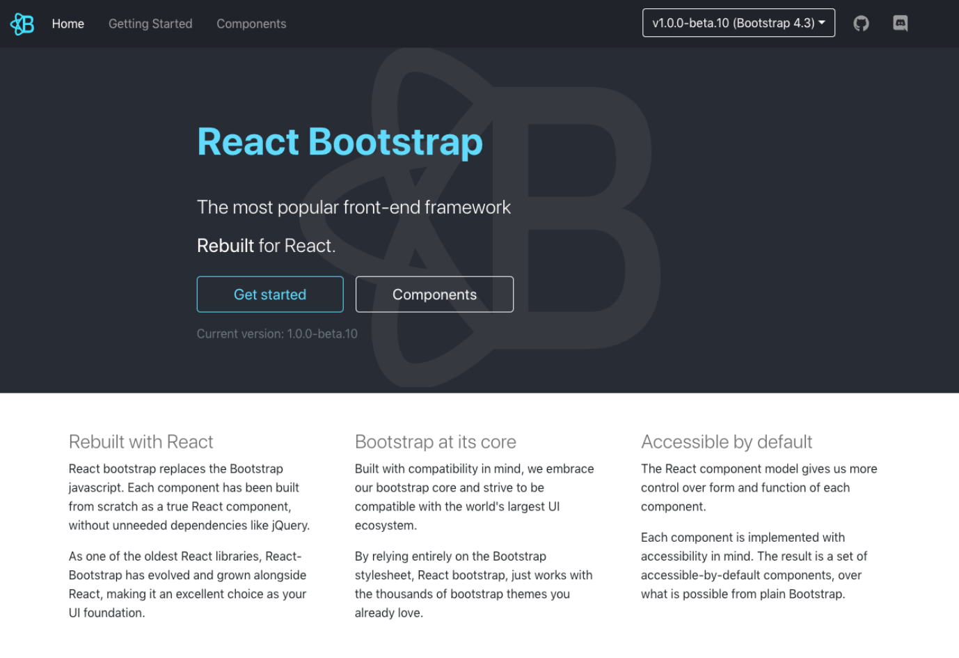
React Bootstrap is the React implementation of the official Bootstrap 4 UI kit. It replaces Bootstrap’s JavaScript with React for better control over component formatting and functionality. Since it’s based on Bootstrap, developers can easily choose from thousands of available Bootstrap themes.
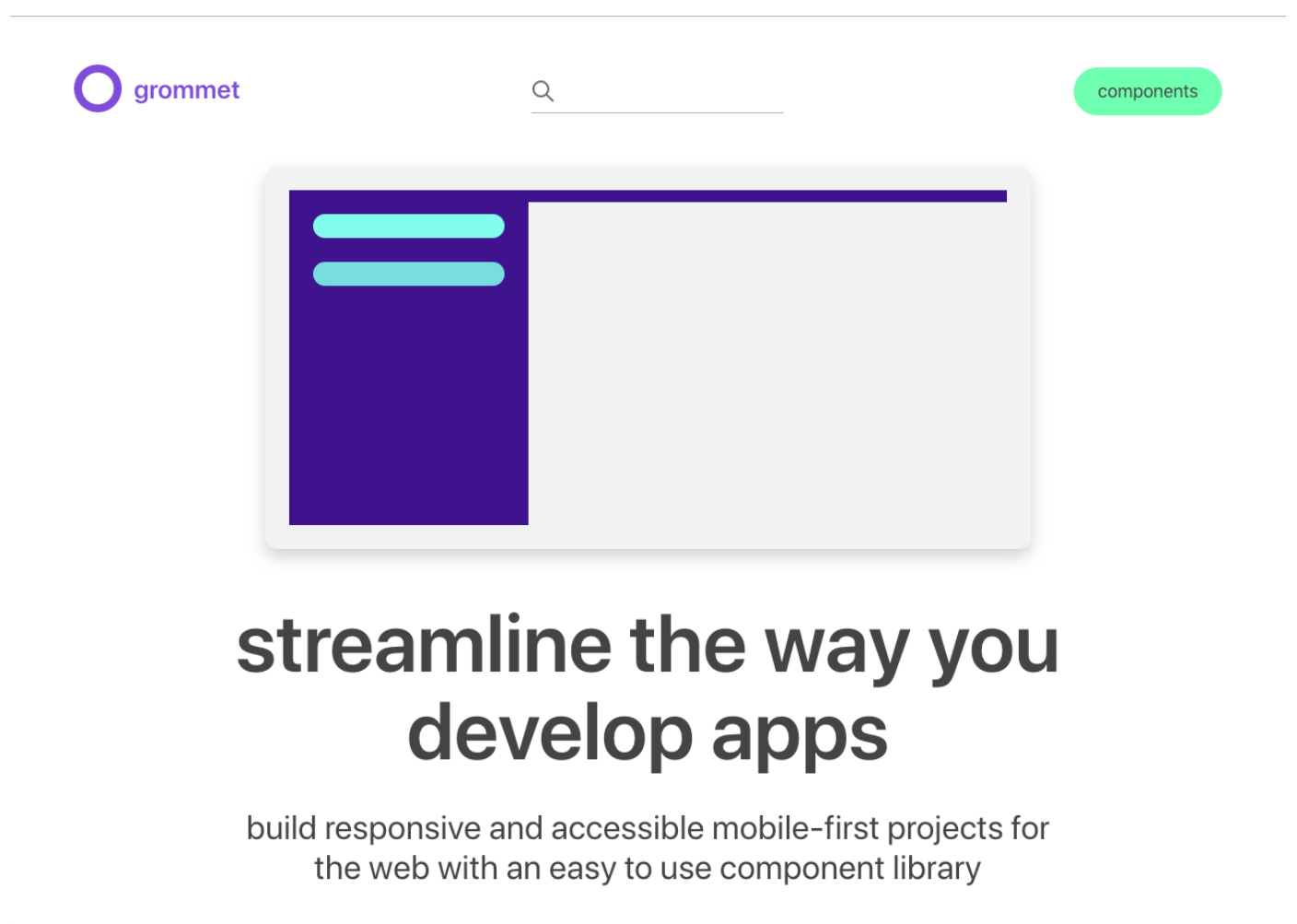
5. Grommet
https://v2.grommet.io/
Grommet offers a variety of component libraries and is used by companies like Netflix and Boeing. It’s designed for responsive layouts and has solutions for accessibility through keyboard or screen reader support. The theme tool helps in customizing colors, typography, and layouts.
Licensed under Apache License 2.0
6. Blueprint
https://blueprintjs.com/
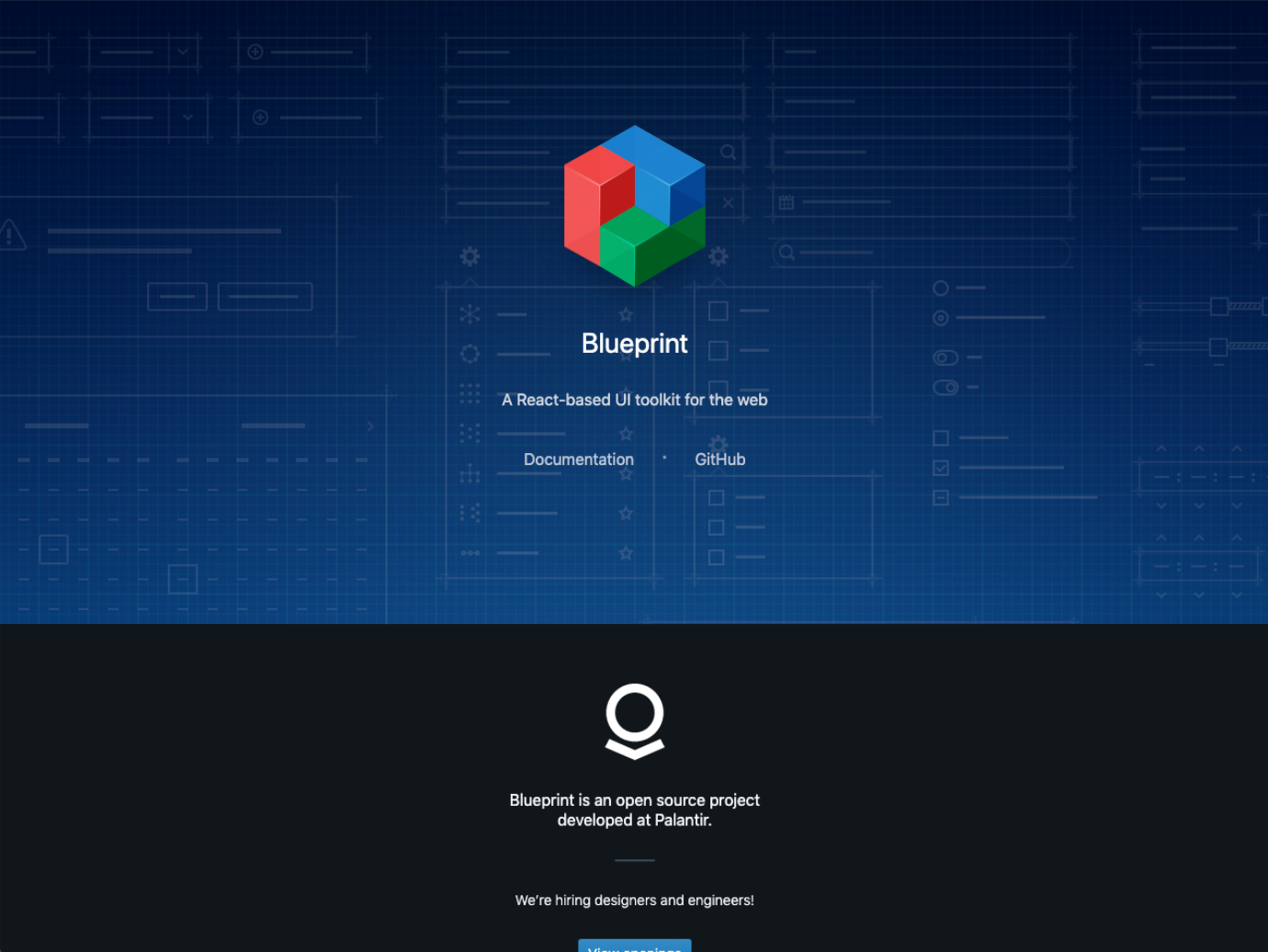
Blueprint is a React-based UI toolkit for building complex, data-intensive interfaces, particularly for desktop applications.
Using component libraries and UI toolkits helps save time by allowing you to use pre-built component sets, making it faster to develop applications.
In this post, we’ll explore Google Material Design and how to use the Material UI framework in React applications.
Material Design
Material Design was introduced at Google I/O in 2014 and has become a highly popular flat design-based design guideline for both web and mobile applications. It provides a set of design and developer guidelines, open-source components, icons, fonts, and resources to help implement UI materials.
Material Design simplifies collaboration between designers and developers and enables quick application development. It also allows you to express a brand’s unique identity using Material Theming.
By using lighting, surfaces, and shadows, it represents a three-dimensional space where all elements move horizontally, vertically, and at different depths along the X-axis. Therefore, multiple elements cannot occupy the same space at the same time.
Material Design layouts are responsive, predictable, and consistent. They respond to user devices and screen elements, using consistent grid lines and padding to ensure intuitive and predictable layout structures.
Design Principles
Material Design is inspired by real-world textures and light, creating hierarchy, meaning, and focus through elements like typography, grid, space, size, color, and images. It uses subtle feedback and consistent transitions to direct attention and maintain continuity.
Elements in Material Design transform and reshape through interactions, creating new variations. It integrates perfectly with custom codebases to fully implement components, plugins, and design elements.
Material Design uses shared components across Android, iOS, and web platforms to maintain a consistent UI across platforms.
Color
The color system uses a systematic approach to represent the brand by selecting primary and secondary colors. The built-in themes define additional colors for backgrounds, surfaces, errors, typography, and iconography. All colors can be customized according to the project.
- Primary Color
Primary colors are the most frequently used colors in the app’s screen and components. You can create a color theme using primary colors and their dark or light variations. - Secondary Color
Secondary colors provide additional ways to emphasize and differentiate the product. It's optional but can be used for specific UI elements like:- Links and headlines
- Progress bars
- Selected text highlights
- Sliders and switches
- Floating action buttons
Material UI
Material UI is one of the most popular React UI frameworks with over 6 million downloads on npm each month. It provides React components that implement Google Material Design. Using Material-UI, you can easily integrate Material Design elements into your React web or mobile applications.
You can check out the library and components at https://material-ui.com/.
CSS Baseline
Material UI provides the CSS Baseline component to establish a consistent and simple foundation. CSS Baseline is applied as follows:
- Page: Margins are removed across all browsers, and the default Material Design background color is applied.
- Layout: The
box-sizingproperty is set globally on the HTML element asborder-box. All elements (including*::beforeand*::after) inherit this property, preventing declared widths from exceeding due to padding or borders. - Typography: The base font size for HTML is not explicitly declared but is assumed to be the browser’s default of 16px. The Roboto font is used for better display of typography.
Creating a React Project
Use create-react-app to create a new React project.
To use Material UI, install it using npm or yarn commands.

Material UI is designed with the Roboto font in mind, so add the Google Roboto font to the index.html file in the public folder:
<link rel="stylesheet" href="https://fonts.googleapis.com/css?family=Roboto:300,400,500" />
After installation, you can apply it in the project as follows:
import "typeface-roboto";
Font Icons
To use font icons, apply them in the same way as the font:
<link rel="stylesheet" href="https://fonts.googleapis.com/icon?family=Material+Icons" />
SVG Icons
To use SVG icons, install them using the command below.

Run the React application.

In the App.js file, delete the unnecessary default content and prepare the project.
Implementing HeaderBar
To add a HeaderBar to the project, first create a new subfolder called components in the src directory, and add a HeaderBar.js file.
To use the AppBar component, import it from @material-ui/core/AppBar.
Set the position of the AppBar to static. Inside the AppBar, add a Toolbar component, which should also be imported in the same way as the AppBar.
Specify the variant and color in the Typography component.
// HeaderBar.js
import React from 'react';
import AppBar from '@material-ui/core/AppBar';
import Toolbar from '@material-ui/core/Toolbar';
import Typography from '@material-ui/core/Typography';

export default function HeaderBar() {
    return (
        <div>
            <AppBar position="static">
                <Toolbar>
                    <Typography variant="title" color="inherit">
                        React Material-UI Sample
                    </Typography>
                </Toolbar>
            </AppBar>
        </div>
    );
}
Next, let’s create a navigation element using the List component.
Inside the List component, insert ListItem components, set them as buttons, and input text into <ListItemText primary="ListItem" />.
There are several ways to apply styles, and we'll explore these in detail in the next post.
Here’s how you can apply styles:
import React from 'react';
import { makeStyles } from '@material-ui/core/styles';
import List from '@material-ui/core/List';
import ListItem from '@material-ui/core/ListItem';
import ListItemText from '@material-ui/core/ListItemText';

const useStyles = makeStyles(theme => ({
    root: {
        width: '100%',
        maxWidth: 260,
        backgroundColor: theme.palette.background.paper,
        minHeight: 'calc(100vh - 64px)',
        borderRight: '1px solid #ddd',
    },
}));

export default function SimpleList() {
    const classes = useStyles();

    return (
        <List component="nav" className={classes.root}>
            <ListItem button>
                <ListItemText primary="REACT 01"/>
            </ListItem>

            <ListItem button>
                <ListItemText primary="REACT 02"/>
            </ListItem>

            <ListItem button>
                <ListItemText primary="REACT 03"/>
            </ListItem>
        </List>
    );
}
In the App.js file, import and apply the Nav menu:
import React, { Component } from 'react';
import HeaderBar from './components/HeaderBar';
import LeftNav from './components/LeftNav';
import Posts from './components/Posts';
import './App.css';

class App extends Component {
    render() {
        return (
            <div>
                <HeaderBar/>
                <div style={{ display: 'flex' }}>
                    <LeftNav/>
                    <Posts/>
                </div>
            </div>
        )
    }
}

export default App;
Material Design Grid System
The Material Design Grid System is based on a 12-column grid layout and provides a responsive layout that adapts to different screen sizes and orientations.
It ensures consistency between layouts while allowing flexibility across various designs.
The spacing unit is based on 8px, with integer values between 0 and 10.
For example, spacing={1} represents 8px, and spacing={2} represents 16px.
Let’s create a layout for the Content area using Grid, and arrange the Card components.
import React from "react";
import { makeStyles } from '@material-ui/core/styles';
import Grid from "@material-ui/core/Grid";
import Card from "@material-ui/core/Card";
import Typography from "@material-ui/core/Typography";
import CardActionArea from "@material-ui/core/CardActionArea";
import CardActions from "@material-ui/core/CardActions";
import CardContent from "@material-ui/core/CardContent";
import CardMedia from "@material-ui/core/CardMedia";
import Button from "@material-ui/core/Button";
import TrendingFlat from '@material-ui/icons/TrendingFlat';

const useStyles = makeStyles(theme => ({
    root: {
        padding: 30,
    },
}));

function Posts(props) {
    const classes = useStyles();

    return (
        <div className={classes.root}>
            <Grid container spacing={4}>
                {posts.map(post => (
                    <Grid item xs={16} sm={6} md={4} key={post.title}>
                        <Card>
                            <CardActionArea>
                                <CardMedia
                                    component="img"
                                    alt="Post Image"
                                    height="160"
                                    image={post.image}
                                    title="Post Image"
                                />
                                <CardContent>
                                    <Typography variant="subtitle2" color="textSecondary" gutterBottom>
                                        REACT 01
                                    </Typography>
                                    <Typography variant="h5" component="h2" gutterBottom>
                                        {post.title}
                                    </Typography>
                                    <Typography variant="body2" component="p">{post.excerpt}</Typography>
                                </CardContent>
                            </CardActionArea>
                            <CardActions>
                                <Button size="small" color="primary">
                                    Read More <TrendingFlat/>
                                </Button>
                            </CardActions>
                        </Card>
                    </Grid>
                ))}
            </Grid>
        </div>
    );
}

export default Posts;
Now, add the data for the posts:
const posts = [
    {
        title: "Post 01",
        excerpt: "Lorem ipsum dolor sit amet, est dictas elaboraret te. An vide magna iriure eum, ex eos nibh accusam.",
        image: "https://picsum.photos/200/300?random=1"
    },
    {
        title: "Post 02",
        excerpt: "Lorem ipsum dolor sit amet, est dictas elaboraret te. An vide magna iriure eum, ex eos nibh accusam.",
        image: "https://picsum.photos/200/300?random=2"
    },
    {
        title: "Post 03",
        excerpt: "Lorem ipsum dolor sit amet, est dictas elaboraret te. An vide magna iriure eum, ex eos nibh accusam.",
        image: "https://picsum.photos/200/300?random=3"
    },
    {
        title: "Post 04",
        excerpt: "Lorem ipsum dolor sit amet, est dictas elaboraret te. An vide magna iriure eum, ex eos nibh accusam.",
        image: "https://picsum.photos/200/300?random=4"
    },
    {
        title: "Post 05",
        excerpt: "Lorem ipsum dolor sit amet, est dictas elaboraret te. An vide magna iriure eum, ex eos nibh accusam.",
        image: "https://picsum.photos/200/300?random=5"
    },
    {
        title: "Post 06",
        excerpt: "Lorem ipsum dolor sit amet, est dictas elaboraret te. An vide magna iriure eum, ex eos nibh accusam.",
        image: "https://picsum.photos/200/300?random=6"
    }
];
By using the Material UI component library, you can easily create React applications that follow Google’s Material Design.
In this post, we’ve covered how to set up and use Material UI in a React project.
(Note that Material UI is not always the best solution for every application. We recommend applying React UI libraries based on the usability and goals of your project.)
In the next post, we’ll dive into the styling methods of Material UI.

