
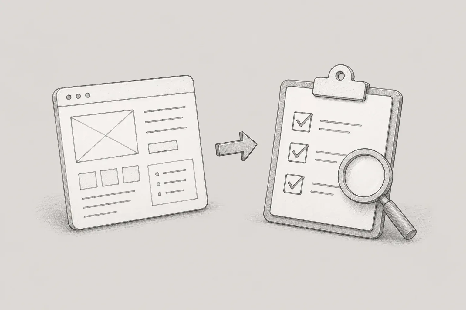
After organizing the requirements and service policies during the earlier planning process, and outlining the IA, menu structure, and user flow to some extent, I proceeded to create screen specifications that translated this information into actual screen-level designs.
At first, I thought a screen specification would be sufficient if it only outlined which functions were needed on each screen and which data should be displayed. However, after creating multiple screens in an actual project, I realized that there was much more to consider in a screen specification than I had expected.
After entering the development phase, I personally tested whether the features had been implemented based on the screen specifications I had written. Through this process, I was able to identify exceptional cases that had been overlooked during planning and errors that occurred during development. I learned through experience that a feature is properly completed only after it has been planned, designed, developed, and tested in practice. I also began paying attention to reducing the service's error rate by reviewing and fixing errors found during testing.
Through this process, I developed criteria that I came to consider important at each stage of screen design and QA. In this article, I will introduce the trial and error I experienced while creating screen specifications and conducting QA in an actual project, along with the criteria I established during the process.
1. Detailed Screen Planning – Trial and Error and Improvements in Creating Screen Specifications
The basic structure of the screen specification I actually used was as follows.
[Cover] → [Table of Contents] → [Revision History] → [Menu Structure] → [Screen List (IA)] → [Permission Matrix] → [Flowchart] → [Common Policies] → [Detailed Specifications]
In particular, I considered the following points important and tried to manage the screen specifications accordingly.
1) Revision History
One area that I ended up paying surprisingly close attention to while working on the project was document version management.
Screen planning was not a task that ended after being completed once.
Changes arose while reviewing screens with developers, and existing screens sometimes had to be revised again when policies changed.
The problem was that as the document began to be revised repeatedly, I started having to check, “Is the document I’m looking at now the latest version?”
and “When and what was changed on this screen?”
Therefore, as the project progressed, I began managing file names and versions according to consistent rules.
For example, I standardized file names as follows.
프로젝트명_화면 설계서_v1.2_20260613.pdfWhen there was a major policy change or the screen structure changed significantly, I increased the leading version number,
while minor changes, such as text edits or changes to some components, were distinguished by increasing the trailing version number.
Distinguishing versions this way made it much easier to compare previous and current documents or check the screen as it existed at a specific point in time.
-
Version scaling rules:
-Deployment and initial client/team-approved version: v1.0
-Major architectural changes, such as a complete revision of the UI layout or changes to core business policies: increment the leading number (e.g., v1.0 ➔ v2.0)
-Minor subfeature additions, alert text changes, or improvements to some components: increment the trailing number (e.g., v1.0 ➔ v1.1)
I encountered another instance of trial and error in version management.
At first, I recorded every minor change to the screens in the history sheet.
For example, I added everything to the history, including changing a single button name or revising the wording of a Description.
Initially, I thought it was best to record every change without omission.
However, as revisions continued to accumulate, the history sheet became overly complicated.
Even when I wanted to check an important policy change, minor revisions were mixed in with it, which actually made it take longer to find what I was looking for.
Therefore, I later divided changes into two categories and managed them separately.
I recorded major changes in the overall history at the beginning of the document, while for minor changes, such as simple text edits or changes to component positions, I left a revision marker next to the Description for the relevant screen.
For example, I indicated the v1.2 revision, the revision date, and the details of the change on that screen.
After making this change, I was able to distinguish between the major change history of the overall document and the detailed changes to individual screens.
In particular, it also made it easier for developers responsible for specific screens to quickly check only the changes to those screens.
2) Description
When designing detailed screens, I worked by drawing the Wireframe on the left side of the screen and writing the Description on the right.
In the Wireframe, I placed the components that would actually appear on the screen, such as Input Box, Select Box, Radio Button, Checkbox, and Data Grid, and added numbers to areas that required explanation.
At first, I focused on creating the Wireframe, but as I planned more screens, I realized that the Description area was more important than anything else.
When I first planned screens, I focused on documenting the functions required on the screen and their basic behavior. However, as I planned multiple screens, I realized that I needed to define in advance not only normal situations, but also cases such as which alert to display when an exception occurs and how the screen should appear when the user first enters it or when there is no data.
As I created the screens, I tried to check the initial state, how data would be displayed, user interactions, validation, and exceptional situations.
① Initial State and Data Display
First, I documented the state of the screen when the user initially entered it.
For example, instead of simply writing “Display table,” I documented the criteria required for actual implementation, such as “The table is sorted in the order of the status priority ‘Failed > Warning > Canceled > Running > Passed’ and displays a maximum of 20 entries.”
② User Interaction and Screen Navigation Policies
I also described in detail what would happen when a button or component was clicked.
For example, “When the [Edit] button is clicked, display the MB_01_P01 layer pop-up in the center without navigating to another screen,” and “The data in the bottom grid is refreshed whenever the selected value in the combo box changes.”
I documented details such as whether screen navigation would occur and the form of the pop-up.
③ Validation and exceptional cases
In normal situations, it is easy to imagine how the screen will behave, but
-
when the input values are invalid
-
when there are no search results
-
when attempting to modify data that has already been processed
-
when a user without permission attempts to access it
situations that deviate from the normal flow, such as these, were easy to overlook.
So, after creating a screen, I developed the habit of thinking once more: “What should happen when this feature does not work normally?”
Through this process, I came to understand that a screen specification is not simply a document that describes a screen, but a document that proactively reduces differences in interpretation that may arise during development.
2. What I learned from writing QA test cases myself
After development was mostly complete, I wrote test scenarios to verify whether the service had been implemented according to the screen specifications I had written.
When I first conducted QA, I thought it would be enough to simply check whether the features worked properly.
However, after actually writing test scenarios, I realized that defining “what to test” in advance is itself important.
Therefore, I organized the following items in the test cases.
-
Test ID
-
Feature and module
-
Screen ID
-
Test account and data
-
Test prerequisites
-
Test procedure
-
Expected result
-
Actual result
-
Test status
-
Defect resolution details
I divided the test procedures and expected results into as much detail as possible when writing them.
I wrote them at a level that would allow the person performing the actual test to follow them exactly.
Writing them this way reduced the number of items I missed during testing, and it also made it easier to explain to developers the circumstances in which a problem occurred when reporting defects.
I classified the test results using the statuses PASS, FAIL, BLOCK, and TO DO.
When something worked as expected, I marked it as PASS, and when it behaved differently from the expected result, I recorded it as FAIL.
When a FAIL occurred, rather than simply writing “Does not work,” I recorded what actually happened.
For example, if the expected result was “The Edit button is not displayed for approved data,” but the Edit button appeared on the actual screen, I wrote, “The [Edit] button is displayed when querying data with an approved status”
as the actual result.
By recording it this way, developers could immediately identify the conditions under which the problem occurred.
In addition, when the next test could not be performed because a prerequisite feature had a problem, such as a login error, I marked it as BLOCK.
By repeating this process, I experienced that QA is not simply a task of clicking through features, but a process of comparing the requirements defined during the planning stage with the actual implementation results.
3. Conclusion
When I first started the project, I thought a screen specification was a document that described the appearance and functions of a screen. However, after creating multiple screens and collaborating with developers, my perspective changed considerably.
Even when planning a single screen, I began thinking beyond “What is visible on the screen?” to questions such as “What state is it in when the user first enters?”, “What happens when there is no data?”, “What changes when the user has different permissions?”, and “What happens when invalid input is entered?”
I also learned that completing the screen design does not mean that a feature is complete. After development, it was necessary to verify the actual implementation against the specifications I had written and to review and correct errors or omissions discovered during testing. I came to believe that a feature is not truly complete until QA has been conducted by comparing the content defined during the planning stage with the actual implementation results.
Rather than trying to define every situation perfectly from the beginning, I gradually established criteria one by one by answering developers’ questions, discovering omissions during QA, and experiencing inconveniences in document management.
Ultimately, I believe that a good screen specification is a document that aligns the standards so that everyone involved in the project can view and understand the same screen and behavior, while QA is the process of verifying that the actual service has been implemented according to those standards.
ryu