

As AI-driven design tools rapidly advance, concerns about the role of designers are also growing.
In the past, the core tasks of a designer were to design screens and create components. Now, we are in an era where AI can generate a significant level of UI in a short time. Naturally, as I saw AI creating increasingly plausible screens, I couldn't help but wonder.
"If creating UIs becomes easier, what will be the competitiveness of designers in the future?"
Recently, the project I was engaged in provided an experience where I could directly feel these concerns. The planning screens were created through AI, and I participated in the project by reviewing those screens.
At first, I thought it would be merely about checking the completeness of the UI created by AI. However, as the review progressed, my interest naturally shifted from the UI to the data structure and user experience.
Then I suddenly recalled the operational metrics tool from a game company I had experienced in the past. Although games and educational services seem like entirely different fields, there were surprisingly many commonalities from the operator's perspective. In games, they manage new user acquisition, churn rates, and retention, while in educational platforms, they manage learner acquisition, course completion rates, and graduation rates. Ultimately, both services share a surprisingly similar structure in that they make operational decisions based on user behavior data.
Recalling that experience, this time I started looking at the screens not only from the designer's perspective but also considering the viewpoint of an actual site operator.
- What information does the operator consider most important on this screen?
- Is the data presented in a way that allows the operator to make quick judgments?
- Does the current visualization method create any illusions of information for the operator?
As I continued the review, I began to think that the issues lay more in how data is conveyed rather than the UI itself.
So, I would like to introduce a few cases I discovered while directly reviewing the screens created by AI.
Funnel graph improvement case
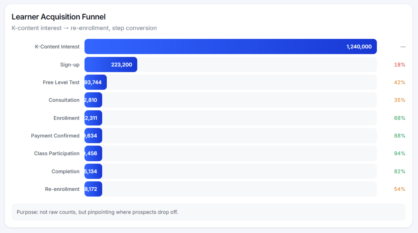
The existing graph shows absolute numbers at each stage based on total user acquisition for the learner acquisition funnel screen. However, what the actual operator is curious about is closer to "how many came in" rather than "at which stage is the most churn occurring."
For example, in a situation where initial acquisition exceeds 1 million, the differences in figures at subsequent stages appear relatively small, making it difficult to identify problem areas at a glance. Additionally, the conversion rate figure is displayed small on the right, creating inconvenience for operators who have to shift their gaze to check it.
So, I proposed a method to visualize based on step-by-step conversion rates rather than just a simple quantity-centric funnel, along with sample screens, and you proceeded with the revisions in that direction.
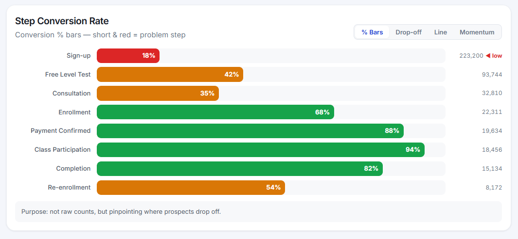
By doing this, operators can immediately see where the most users are dropping off and can judge improvement priorities more quickly.
For example, if the conversion rate at the registration step is 18%, the fact that '220,000 people have signed up' is much less important than the insight that '82% of the target users did not proceed with signing up.'
A graph that actually hinders interpretation when displayed together.
This time, it is a screen that represents two sets of data with different characteristics in a single graph.
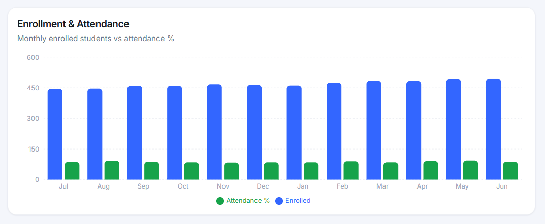
The number of registered students and attendance rate are both important indicators, but they have different units. The number of students is an absolute value in the hundreds, while the attendance rate is a percentage data ranging from 0 to 100%. When these two indicators are expressed on a single axis, the relatively small change in attendance rate becomes almost invisible.
In practice, from an operational perspective, changes such as a drop in attendance rate from 95% to 80% can be very important signals, but it is difficult to visually capture such changes in the current graph.
So, I proposed suggestions to improve by either separating the graphs or using a dual Y-axis so that each indicator can be interpreted independently.
Is a high completion rate necessarily a sign of a good lecture?
The most concerning part during the project was the completion rate data.
On the dashboard, courses with high completion rates were displayed at the top, and at first glance, they seemed like the best lectures. However, the actual operational data is not that simple.
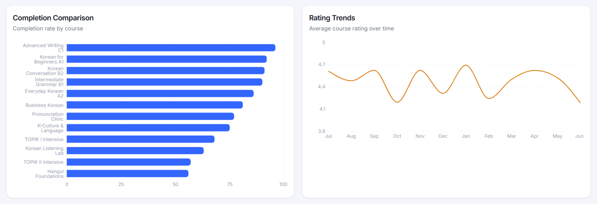
For example, Course A may have a completion rate of 96% with 50 students enrolled.
On the other hand, Course B may have a completion rate of 60% but 500 students enrolled.
When looking solely at completion rates, Course A seems superior, but the actual number of graduates from Course B is much higher. Additionally, the interpretation of the results may vary depending on the lecture difficulty or operational purpose. If only one indicator is emphasized, there is a risk that the operator may reach an incorrect conclusion.
Therefore, I concluded that a method that allows viewing alongside the number of students or providing the actual number of graduates would be more appropriate than a simple comparison of completion rates.
Single Rating Data shown also appearing trap
If there is a lecture with a rating of 4.9 and a rating of 4.2, is the 4.9 lecture the better lecture?
If the 4.9 rated lecture has 10 reviews and the 4.2 rated lecture has 200 reviews, it's also difficult to judge this part with just simple ratings.
Through the above examples, I realized that placing data on the screen and making data understandable are different areas, and it is necessary to consider how operators will make judgments, requiring design enhancements and considerations.
I have come to think that a good dashboard is not a screen that shows a lot of data, but a screen that helps users ask the right questions.
The designer's next competitiveness
As design systems become commonplace and we enter an era where AI automatically generates UI, the creation of UI itself is gradually becoming a fundamental capability. Moreover, AI is expected to continue evolving, and areas that currently feel lacking will gradually be supplemented over time.
In the midst of these changes, many designers, including myself, will inevitably be contemplating the future. However, I still believe that just because technology is advancing, the role of designers will not completely disappear.
Rather, as repetitive tasks become automated, the ability to design information structures, consider user experience, and understand the essence of the service is deemed even more important. The more complex the service screen, the more detailed aspects that can be overlooked arise, and there is still a need for someone to take care of these parts.
This does not replace the planning area, but rather, it's about clearly understanding the business intentions designed by the planner and visually translating them so that they can be conveyed to users without misunderstanding. I believe this could be a distinguishing feature that designers can have in the future.
Ultimately, what matters is not AI itself, but how to expand one's role in a changing market. I believe that if designers continuously seek growth directions in line with these changes, they can still play a meaningful role moving forward.
Through this project, I have rethought the role of interpreting data and delivering information from the user's perspective, going beyond just creating screens. I have been given the task of utilizing AI effectively while contemplating more deeply about the areas that need to be done by humans.
RIMS