
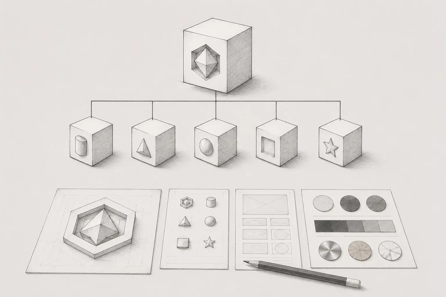
In an environment where multiple product lineups must be developed, operated, and expanded simultaneously, practical designers face structural issues that need to be addressed. By deeply extending the concepts of the three core brand architecture models (House of Brands, Branded House, Hybrid), we define the practical connections between business context and design infrastructure building in detail.
1. The practical concerns of designers in a multi-product environment and the necessity of brand architecture
As companies grow and businesses evolve, the transition from a single product system to a multi-product environment, where multiple products are operated simultaneously, inevitably occurs. As a designer, when there is only one product, it is relatively easy to focus entirely on one screen and fixed brand guidelines, which may result in less concern about the structural fragmentation of the interface or the overall integration ratio. However, when new services are launched in succession or business domains expand, completely new questions arise that cannot be easily resolved with the existing single system.
The first question encountered is the scope of shared visual identity. The fundamental question arises: "How similar should the logo and symbol structure of the newly launched product be to the main brand? Or should it be entirely newly created for differentiation in the market?" This leads to practical asset management issues. Specific concerns follow: "Should all products perfectly share a company-wide color system, typography scale, and font assets? Or should independent tokens be defined according to the target user tendencies of individual domains?"
Furthermore, confusion regarding development productivity and asset utilization at the component level intensifies. Questions arise regarding whether "core UI components such as buttons, input fields, modals, and dialog tables can be sourced from a single common source library without disrupting business context?" Technical and visual reviews are required. If these series of questions are addressed in an ad hoc manner without clear upper criteria, it may allow for quick releases in the short term, but in the long term, as the scale of the product increases, the overall visual system and user experience can collapse like a sandcastle. As a result, users may experience extreme confusion and cognitive fatigue, wondering, "Is this really a service from the same brand?"
Brand architecture is a structural solution that prevents such fragmentation risks and establishes the direction of the design system based on a solid and systematic framework. Brand architecture is not simply about how visually glamorous something appears. The key is to first clearly define the organic relationship and hierarchy between the parent brand (main company) and the sub-brands (individual services and products). By clarifying the integration and independence between brands before building the design system, specific design decisions at lower levels, such as color transformation extraction, global typography application, and permitting variable properties of components, can be naturally and clearly guided. Therefore, for practical designers in a multi-product environment, brand architecture serves as the most powerful compass controlling the Figma canvas and component library they encounter daily, rather than being just a branding theory.
2. The three basic models of brand architecture and their integration with design systems
When analyzing the brand assets and product lineups of numerous multi-product companies around the world, they converge into one of three patterns based on the way visual language is connected and operated. It is recommended to deeply read and match the business situation our organization is facing and which model the current product lineup belongs to, or which direction it is planned to expand in the future.
① House of Brands: Maximized independence and specialization of individual domains
The House of Brands model operates with each product as a completely independent brand, possessing a unique position in the market. A significant characteristic is that the visual language, shadow, or name of the parent company is rarely revealed in the front interface that the end consumer encounters. The most intuitive and representative global example is P&G (Procter & Gamble). When an ordinary consumer encounters it in daily life, they tend to recognize the strong identity of individual product brands, such as 'Febreze,' 'Gillette,' 'Oral-B,' and 'Downy,' rather than the identity of the P&G company first.
In a multi-product environment adopting this structure, the designer's perspective emphasizes 'maximization of individuality and domain optimization.' Products belonging to the House of Brands have perfectly separated target user groups, domain characteristics, and competitive market environments. It would make no sense for the interface or graphic style of the air freshener Febreze to have any connection to the packaging and web store guidelines of the shaving brand Gillette. Therefore, designers dealing with this model need not attempt to forcibly share or combine a single design system that is universally applicable across the company.
Rather, it is appropriate to independently build the visual system, brand colors, typography guides, and component styles entirely from start to finish, aligning with the psychological context of the users targeted by each product line and their business objectives. This is the stage where the necessity of a common component library is eliminated, and efforts should be focused on designing visual impacts that allow each individual brand to appear most attractive and flexible in the market.
② Branded House: Extreme consistency and sharing of a single master asset
The Branded House model is positioned exactly at the opposite extreme of the aforementioned House of Brands. All individual products and sub-services are grouped under one strong 'Master Brand' umbrella, sharing a perfectly unified visual language and brand philosophy throughout the organization. The most perfect and intuitive example is Apple. The hardware lineup such as 'iPhone,' 'iPad,' 'Mac,' and 'Apple Watch,' as well as the software interfaces of iOS, macOS, and iPadOS, all share an extremely unified visual language and philosophy under the giant umbrella of Apple.
In an environment adopting this structure, for designers, 'maintaining consistency and centralized system management' becomes an absolute premise prioritized above any other value. In the Branded House model, users should feel that every rule, from font types, the subtle ratios of letter-spacing and line-height, to corner radii, and the quality and speed of interactions triggering popup modals, remains perfectly uniform. This is because an organic experience that blurs the boundaries between products must be provided.
Therefore, designers should avoid fragmented individual tasks and focus on the role of meticulously constructing and rigorously maintaining a single advanced and massive design system. It requires a high level of system design ability to tightly design Figma's component guidelines and global token systems so that even when new services or functions are added, it is perfectly controlled not to deviate from the visual rules of the existing master brand by even 1px.
③ Hybrid (Endorsed / Hybrid): A practical compromise of strategic flexibility and reliability
The hybrid model guarantees some of the visual assets or market credibility of the parent company while preserving the independent identity and functional uniqueness of individual sub-brands. It cleverly takes advantage of the benefits between complete independence (House of Brands) and complete integration (Branded House), and it is a commonly used practical compromise in the multi-product environments of many IT tech companies and startups we encounter in practice.
For example, when a company that has achieved strong success in a specific domain expands its business by sequentially entering completely different verticals such as finance, mobility, shopping, and messaging, this model is actively utilized. Each service needs its own UX/UI context and unique color theme, such as the expertise of a finance app and the flamboyance of a shopping app. However, at the same time, to give users a sense of stability and trust as part of the same family brand, the core symbol structure of the parent company is partially modified and applied, using its unique key color as a mapping point element throughout the interface, and adjusting the backbone by sharing a common global font system.
Designers in a hybrid environment must demonstrate a 'perfect sense of balance between a common backbone and individual variations.' If unconditional consistency is enforced, the business attractiveness of each service will diminish, and conversely, if too much freedom is given, brand fragmentation will occur. Therefore, the delicate design of the token map regarding where to group as company common tokens (Primitive/Semantic Tokens) and where to let individual product-specific variables operate flexibly becomes very important in practice.
3. Multi-product design approaches based on the nature of the business (B2B vs B2C)
If a structural brand architecture model has been established in the mind, the designer must take a step further and completely change their fingertips' sense of design screens depending on whether the actual business these products encounter is B2B (Business-to-Business) or B2C (Business-to-Consumer) for general consumers. The two environments show fundamental differences in the psychological context and usage method of how users consume the product.
Firstly, the tendencies of the brand architecture model adopted and the scope of visual controls differ. Multi-products in a B2B environment typically need to prove high reliability and stable scalability to corporate clients as enterprise solutions. This is because the completeness of the product directly translates to the productivity of the client's business. Therefore, in the B2B environment, the 'Branded House' model, which prominently showcases the trust of the master brand, is strongly preferred, and accordingly, the layout structure of the entire screen, component density, and consistency of color mapping rules are controlled in a very dense and strict range. In contrast, in a B2C environment, the model is often 'Hybrid' or 'House of Brands' because it must quickly absorb rapidly changing market trends and respond agilely to the emotional needs of diverse users. Visual control is kept comparatively loose, allowing each service to freely express the personality of the visuals to match the user segments they are targeting.
Secondly, distinct differences arise in the fundamental values and purposes of building and operating design systems. The primary purpose of B2B multi-product design systems is to maximize development and design productivity and minimize 'learning costs' for users. Most B2B products deal with extensive data tables, high-density dashboards, complex setting forms, etc. Users do not use this product for enjoyment but to 'complete tasks.' Therefore, designers must push the structural consistency of components to the extreme, allowing users to instinctively figure out how to operate any new solution screen without separate training, eliminating cognitive friction. On the other hand, the core purpose of B2C design systems is to differentiate strong brand recognition and emotional experience that captures the user's attention immediately. The main mission is to refine the precision of micro-interactions, graphic motifs, and color play to ensure users can feel visual enjoyment and smooth emotional interaction during the service usage process.
Thirdly, the psychological and physical contexts of users switching between screens (Context Switching) are completely different. In a B2B environment, it is common for a single worker to open multiple independent dedicated solutions on the same monitor screen simultaneously while switching back and forth in real time to handle tasks. If the button positions of two products, the visual effects of the input field's focus state, and the row height density of tables vary during the process of copying data from a customer management tool and entering it into a settlement management tool, users will experience a subtle cognitive shock at every moment, drastically reducing work efficiency. Therefore, B2B designers must design perfect regularity to reduce the illusion of handling tasks as if switching only between the top tabs within a large single program. However, in a B2C environment, users move in entirely different contexts. They open a commerce app in the morning to order fresh produce and switch to a music streaming app or content platform in the evening after work to relieve stress. The users consuming these two services have completely separated time zones, spatial backgrounds, and purposes, so even if the design themes and interface tone and manner of the two products are vastly different, users do not perceive this as fragmentation and naturally accept each as independent charm.
4. Three core guidelines for practical designers in building a multi-product design system
If you fully understand the theoretical structure and business context, it's time to return to the monitor of the practical designer who has to control numerous product lineups simultaneously from tomorrow by opening the complex Figma canvas. Here are three essential practical guidelines that must be followed for the design assets to function sustainably as an unentangled infrastructure.
-
Clearly separate the architecture of global core assets (Core assets) and domain variable assets (Variable assets).
One of the most critical mistakes commonly made in a multi-product environment is the excessive desire to unify and lump all elements within the design system under a single rule. If everything is unified, the unique business requirements of specific product groups will not be reflected, leading to a bottleneck phenomenon where the system itself is ignored in practice. A wise designer differentiates system assets into solid core assets and flexible variable assets. Areas that form the foundation of the brand, such as the utilization ratio of the company's logo, the line-height ratio formula of typography, and the global layout grid system, should be tightly locked as the company common 'core assets' so that no one can arbitrarily modify them. Meanwhile, elements that need to be changed according to the mood of a specific domain, such as point key colors, unique illustration skins, and table densities dedicated to dialogs, should be kept open as 'variable assets' to allow flexible switching according to product groups, utilizing Figma variables and theme functions for responsive designs.
-
Elevate the abstraction level of design components and transform them into master templates.
When designing code components for a Figma library or development team, we should avoid defining them in a narrow and specific way, such as "service A exclusive blue rectangular button." Creating components this way leads to inefficiencies where we have to create new buttons with the same structure each time products B and C are added, merely changing the names, which ultimately disrupts the design system. Instead, we should maximize the level of abstraction of the components to create a "structural master button" that can receive theme color tokens from the outside based on the situation and context, allowing for flexible control of internal text, padding density, and the presence or absence of left and right icons according to the props values. This elevated component level becomes a powerful tool that maximizes structural reusability while sharing a single source component, regardless of how much the business domain expands.
-
Invest resources generously in design documentation and history management.
When the number of products starts to increase, the communication costs between the designer organization, as well as the development and planning organizations, explode exponentially. Multi-product design that is not supported by documentation inevitably becomes fragmented over time, no matter how well-made the system is. The decision-making background and usage rules (Do & Don't) regarding questions like 'Why did service A apply these variations in layout instead of using the master component from the common library as it is?' and 'What is the scope of the visual tokens that have been exception-handled in a specific domain?' should be meticulously recorded in the component description sections of Figma files or in a dedicated company wiki page. Documentation is not simply the act of leaving records; it is the most reliable communication infrastructure that ensures all team members maintain the same sync in the complex environment of multi-products.
5. Conclusion: The Insight of Flexible System Designers Leading Business Change
The fact we must always remember is that modern business is like a living organism that is always moving. The brand architecture model that we define today, which we judge to perfectly fit our organizational structure, can be shaken and changed at any time according to the company's rapid mergers and acquisitions, a company-wide pivot, or new global market entry strategies. In fact, countless global Silicon Valley tech companies have started as perfectly unified branded houses to reduce initial costs, but as their business areas expand, they continuously undergo structural transformations, shifting to hybrid models, and when the volume of specific services becomes enormous, they completely separate them into a house of brands format to operate independently.
We expect to objectively and clearly observe the current business situation of our company's product lineup and the user's context, and to build the system with a macro objective in line with the business speed and trajectory by combining the design system's integration and flexibility.
khg