
Introduction
Over the past few months, we have been implementing our internal design system, VUI (Vizend UI). VUI is a common language and promise that ties together designers and developers, allowing them to create products in the same way. It is a design system that weaves together design tokens, components, patterns, principles, and automation that connects them to code. The underlying engine used is MUI (Material UI). I will briefly introduce how we are creating the design system.
The order is as follows.① Why a design system was needed,② The reason for using MUI as a base,③ Design tokens used in the design system,④ The working principle of the MUI theme, how the design tokens are consumed by the MUI theme, and the method of applying tokens to actual components,⑤ How to separate and configure themes by modes such as mobile/desktop and light/dark, and finally,⑥ Problems that have not yet been solved.
1. Why was a design system necessary?
A design system is often thought of as a collection of 'reusable UI components.' However, the essence of the design system I experienced was a common language and commitment to the way products are created. To put it metaphorically, if the UI Kit is a 'basket of Lego blocks,' the design system encompasses the factory that produces the blocks, the assembly instructions, and the blocks themselves.
The starting point was AI. As we attempted to automatically generate front-end code through AI, we needed a well-organized and implemented system that AI could understand. The second reason was that once the system was built, design/publishing could proceed with fewer people. A method relying on human memory and diligence quickly collapses as the number of people decreases, and the usability of AI also declines. We set the biggest goal of assetizing design based on the principles of VUI of 'mandatory and automation of the system.'
The costs of lacking a design system were concrete.
-
Fragmented experience: Even though it's the same 'button,' the curvature, color, and height vary subtly on each screen. If not controlled, it becomes a different face for each product.
-
Communication overhead: Ambiguous requests like 'Make that blue a bit darker' bounce back and forth between design and development like a ping-pong ball.
-
Repetitive work (Toil): The simple repetition of manually styling each screen eats up time that could be spent on business logic.
Thus, what VUI pursued was not mere consistency but engineered consistency. It's about communicating with a common language called Semantic Token. Instead of saying 'Make the background a darker gray,' we say 'Change Background-Default token to Background-Dark,' making design decisions immediately data-driven and trackable/rollback-able.
2. Choosing MUI
When creating a design system, the first crossroads you encounter is Build vs Buy. Should we create all components ourselves or adopt a validated library and customize it? I chose the latter and selected MUI (Material UI) as the base.
2.1 Building it yourself
It's not difficult to create a single button. The problem is that this button is Keyboard focus, screen reader (ARIA), inactive state, RTL, cross-browser compatibilityIt is said that only by considering all of these will there be 'product quality'. In addition to this,DataGrid, DatePicker, Autocompleteif we create and maintain complex components like this ourselves, the resources of a small team will be exhausted on 'reinventing the wheel' instead of business logic. The quality of accessibility and compatibility will also vary depending on team capabilities.
2.2 Candidate Comparison — Reasons MUI Won According to Our Criteria
The criteria I set when choosing a library were threefold: ① How deep and secure is the theme customization for branding, ② Is there a sufficient ecosystem of complex components for enterprise screens (tables, dates, auto-complete), ③ Is synchronization with Figma possible (design-development synchronization)?
|
Candidate |
Strengths |
Weaknesses |
|---|---|---|
|
Building from scratch (headless combinations) |
Complete freedom |
The cost of building, accessibility, and maintenance is the highest — unrealistic for small teams |
|
Ant Design |
High-quality enterprise components |
Design language is strongly fixed — redefining the brand and deep theming is difficult |
|
Chakra UI |
lightweight and token-friendly |
the ecosystem of highly complex components like tables/dates is relatively shallow |
|
MUI (optional) |
the depth of createTheme overrides + x-data-grid·x-date-pickers ecosystem + Material Figma Kit alignment + large community |
Material design colors remain → need to be covered with tokens/wrapping |
what was decisive was MUI'sofficial theme override API (createTheme)This means that brand styles can only be injected at the 'configuration' layer, which enabled the following principle.
2.3 Natural Upgrade — “No Forking” principle
The biggest risk when using open source occurs the moment you fork (modify) the original for customization. The moment you fork, you become forever distant from upstream updates. Therefore, VUI adheres to the rule thatdoes not modify MUI's source or node_modules.All customizations are made solely through the Theme Override API officially provided by MUI. The result is 'freedom of maintenance' —npm updatebrings security patches and new features naturally with a single command, while our brand overrides remain intact.
The button of VUI simply wraps MUI's Button, and the shapes like color, curvature, and spacing are allToken → Themeapplied through the path. By wrapping it thinly like this instead of forking and modifying the original, the wrapper does not break even if the MUI version is upgraded.
3. Figma as SSOT — Coding Design Tokens
The lowest layer (Layer 1) in VUI's six-layer architecture isDesign TokensTokens abstract all visual decisions like color (#Hex), spacing (px), typography, and curvatureinto platform-independent data.The difference between hardcoding and tokens lies in the 'meaning'.
// Bad — 이 색이 무슨 의미인지 코드만 봐선 모른다
background-color: #2196F3;
// Good — '브랜드의 메인 컬러'임이 이름에 드러난다
background-color: tokens.color.brand.primary.main;
The core principle is thatFigma is a Single Source of Truth (SSOT)If you want to change color, you change it in Figma, not in the code, and the code simply 'takes note' of that decision. To do this, we have eliminated the manual process of transferring tokens and automated it through a pipeline.
3.1 Token Coding Pipeline (Figma → JSON → TS)
The pipeline consists of three stages. First, the designer defines the color, spacing, and typography values in Figma Variables using a Figma custom plugin,W3C DTCG standard JSONExtract in the format. Next, we use a library called Style Dictionary to resolve the reference chain between tokens (component → semantic → primitive) into actual values. Finally, the results are saved as TypeScript files, and this design token is consumed by MUI. Visual decisions made in Figma flow down to code tokens without human intervention. Even if there are broken references,it logged them without failing the build.This was to ensure that CI does not stop while the design is changing. Once extracted in standard format (W3C DTCG), any tool can read it afterward, enabling automation.
3.2 Token hierarchy, reference relationship (Semantic Naming — primitive → semantic → component)
Tokens are structured in three layers so that their purpose can be known by name.primitive(paint itself: blue-500), semantic(meaning·role: primary-main), component(specific part usage: button-contained-bgOnly unidirectional dependency (primitive ← semantic ← component) is allowed so that changing only the paint at the bottom updates everything above it.
// primitive — 물감 자체 (실제 색 값)
color/blue/500          = #2196F3
// semantic — 의미·역할 (primitive 를 가리킴)
color/primary/main      = {color.blue.500}
// component — 특정 부품의 쓰임 (semantic 을 가리킴)
button/contained/bg     = {color.primary.main}
// → blue-500 한 곳만 바꾸면 primary, button 까지 연쇄 반영된다
4. How does MUI Theme consume tokens?
If the token is data (Layer 1), the engine that converts that data into the 'clothes' of the actual component is MUI Theme(Layer 2)It is essential to understand how the MUI theme works here.
4.1 How MUI Theme Configuration Works — 3 Channels
MUI components are ThemeProviderReceived in contextthemeReads the object and calculates the style. The injection channel consists of three main channels.
-
Global design value: palette / typography / spacing / shapeglobal value shared by all components
-
Default props: components.MuiX.defaultProps — Default behavior and appearance of the component
-
Style overrides: components.MuiX.styleOverrides — Styles for each variant·color·state combination
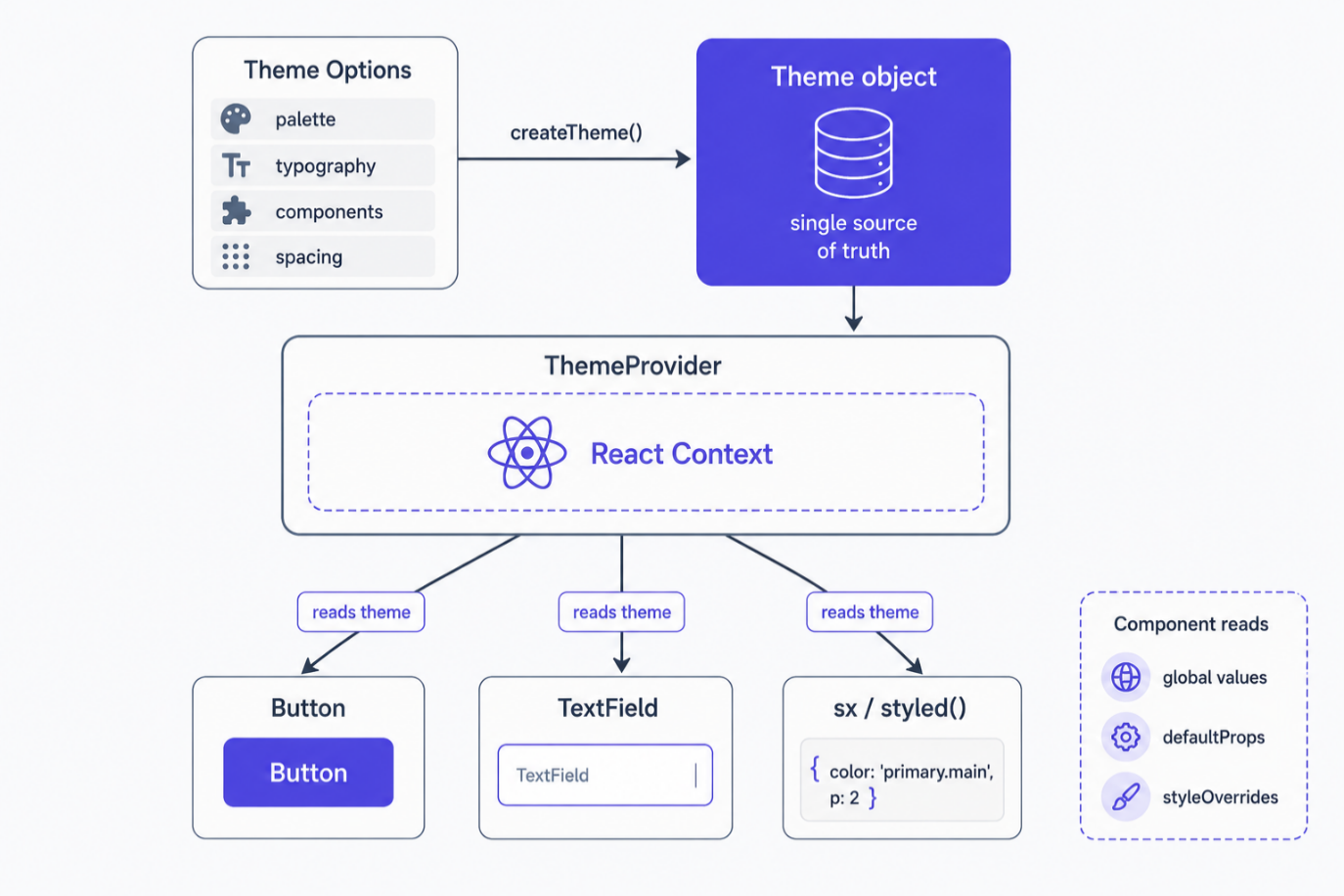
VUI fills all three channels with tokens.So, by changing just one place (ThemeOptions) all components change at the same time. The theme creation is wrapped in a helper that takes brand·mode as arguments.
4.2 token-adapter — “Values are automatic, structure is manual”
If you write the path of the automatically generated token (e.g., component.button['md-radius']) directly into the component styles, the code breaks every time the designer changes the token structure. So, token-adapter.tsis used tomap the path of automatically generated tokens to a reliable slot name onceDone. After that, the tokenvalueremains unchanged while the path is automatically reflected, and only when the tokenstructure (path)changes, a single line in the adapter is modified.components.tsreceives the tokens exposed by this adapter, such asbuttonTokens / chipTokens / alertTokensand writes MUI styleOverrides.
// components.ts — token-adapter 의 슬롯을 MUI styleOverrides 로 연결
import { buttonTokens, chipTokens, alertTokens } from './token-adapter';

// MUI Theme 객체에 선언된 MUI Button 스타일 선언코드
MuiButton: {
  styleOverrides: {
    contained: ({ theme, ownerState }) => ({
      backgroundColor: buttonTokens.variant.contained.bg[ownerState.color],
      borderRadius: theme.shape.radiusControlSm,
    }),
  },
}
VUI-specific slots not present in the standard MUI palette (e.g., surface / field / border / icon / overlay) is module augmentationto extend the type, theme.vui or allowed access through the extended palette slot(mui-augmentation.tsYou can extract numerous tokens without confusion using only IDE autocomplete — The type system is a document that can be referenced soonIt means.
4.3 Validating Design Token Consistency with Figma MCP
One of the important tasks when building a design system is to connect the 'component specs defined in Figma' with the actual tokens and themes, and to ensure that the two do not diverge.Verify design consistencywas the task. Recently, this comparison processAI Agentuses.
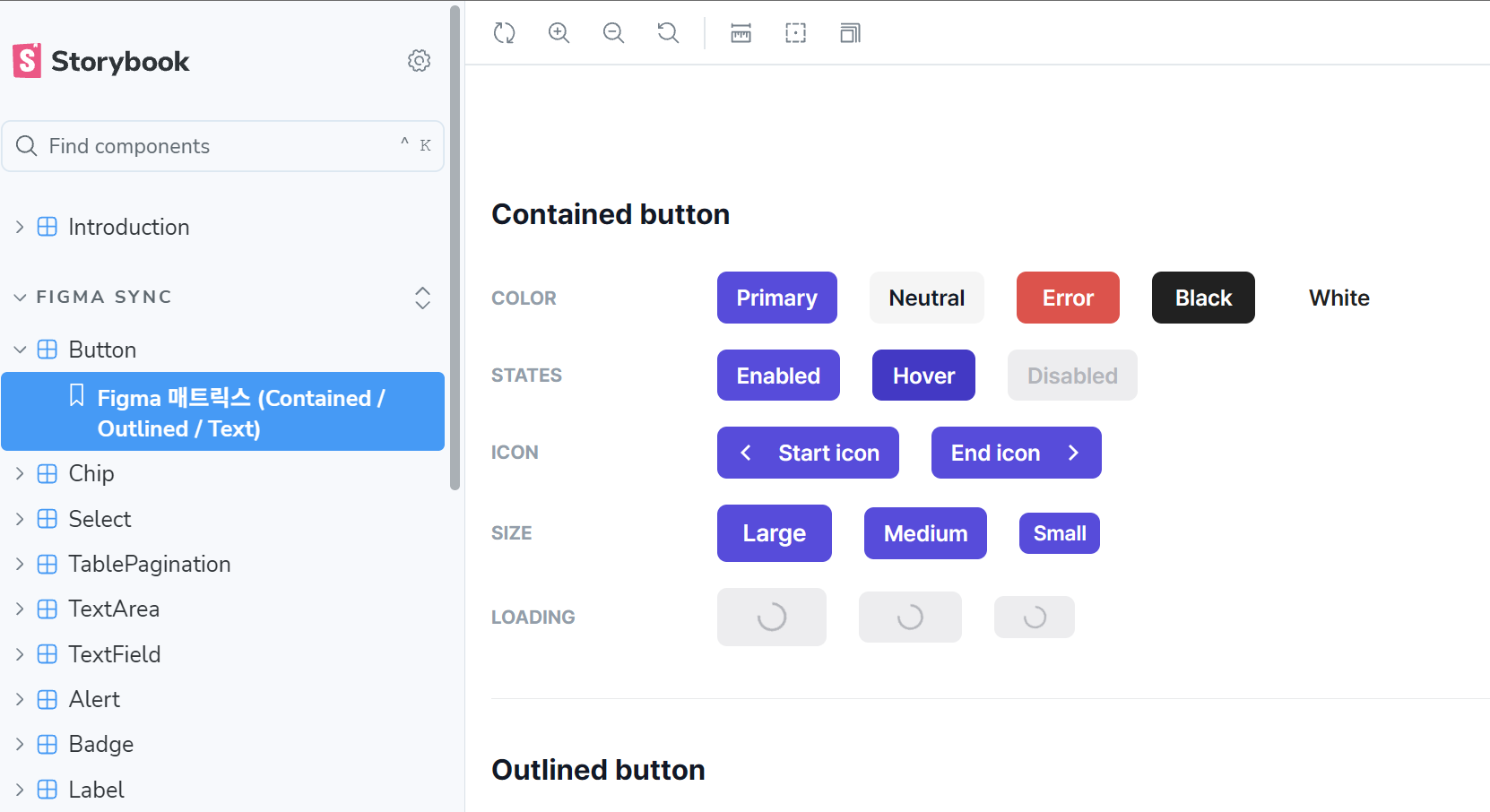
The core is two steps. First The design token information actually applied to specific components within the Figma frame by the AI Agent through Figma MCPYou will read and analyze directly which variables (color, typography, spacing, radius, etc.) are bound where. Then, you will use this Figma-side token information for the component.The Storybook that has been implementedcompares.
<Storybook>
<Figma>
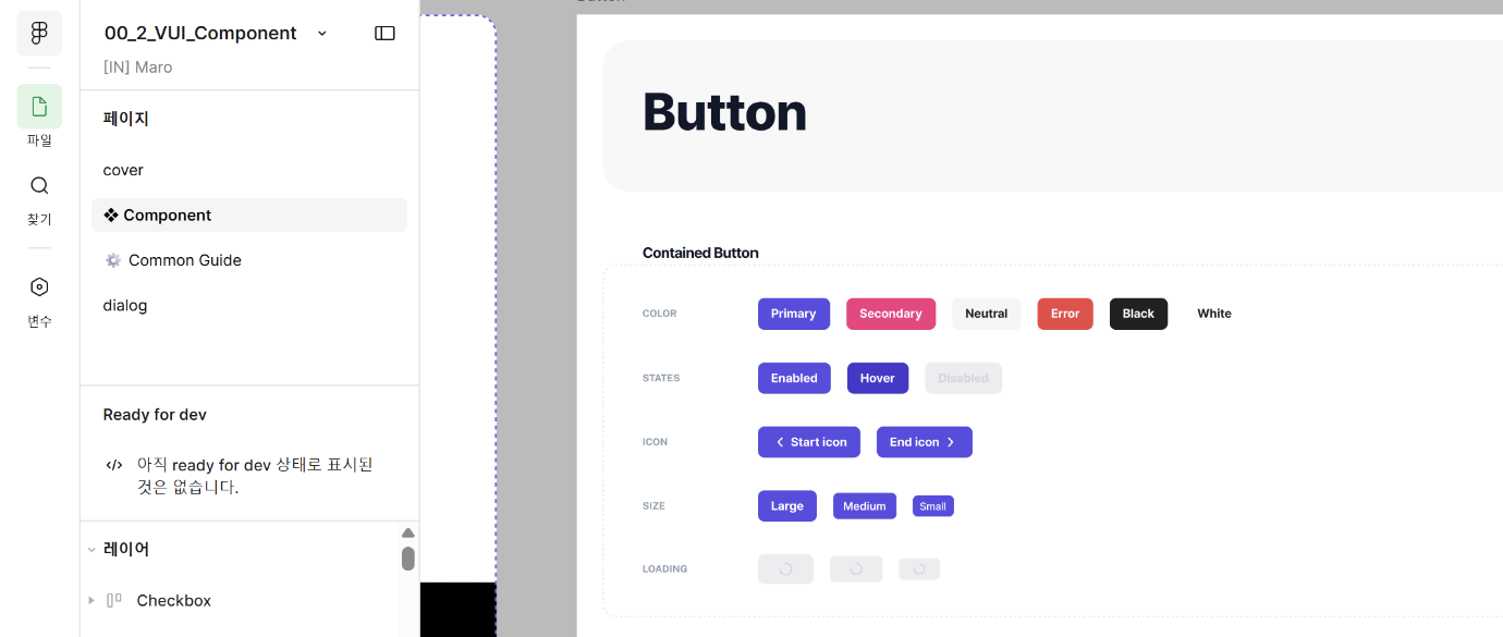
The AI Agent compares the two results side by side in the implementation code.Missing design tokensor Parts that do not match the values in Figmacan be inspected. The AI Agent serves as a first filter for what humans would typically compare visually each time. The reason this validation is possible is ultimatelyCommon language called tokensThanks to this — Figma and code can be represented with the same standard (tokens), allowing for automatic comparison to be established.
5. Theme configuration by mode — Components remain the same, only the theme changes
The actual product isn't limited to just one screen. It needs to display equally well on large monitors and small phones, on bright and dark screens, and across different brands. VUI handles all these variations simultaneously, and the key is Keep the component code as is and just change the 'theme'is the key point. The axis of this transition is threefold.
-
Screen size (desktop/mobile) — Even with the same components, when the screen size decreases, the font size and spacing automatically become tighter. The theme recognizes the screen width and changes to desktop or mobile values accordingly.
-
Light/Dark mode — The background and text colors change entirely according to the mode. When the user enables dark mode, the components remain unchanged, but the color sets are simply replaced with dark ones.
-
Brand (e.g., vizend/devlime) — Each product can be infused with different brand colors and atmospheres. If a new brand is needed, you just need to redefine the colors in the design and add it.
The important thing is how these three axes can be combinedThe developer does not change even a single line of the component code.That is, once it is determined at the top of the screen 'which brand, which mode', all components below will automatically apply the appropriate theme. Instead of inserting complex branches into each component, the complexity is elevated to a layer called theme, keeping the bottom simple.
// 맨 위에서 '브랜드 / 모드'만 정하면 끝 — 컴포넌트 코드는 그대로
<VuiThemeProvider brand="vizend" mode="dark">
  <App />
</VuiThemeProvider>
6. Problems still to be resolved
These are the tasks that have become clear during the design and implementation process, which have not yet been solved.
6.1 Design token mapping problem — Cannot manage all styles with MUI Theme.
The meaning-based colors of VUI are not compatible with MUI standards.theme.palette does not fully map to the slot structure. The MUI paletteprimary/secondary/text/background assumes a level of granularity, but our semantic tokens are much richer than that. As a result, vuiColors.bg.surface such helpers or CSS variables have increased the paths of bypassing access. The issue of defining the meaning of text.muted in Figma, where there is no place to encapsulate that meaning in the MUI palette's text slot, has been partially mitigated by module augmentation, but the awkwardness of coexistence between standards and extensions remains.
6.2 Asymmetry in structure change detection, and incomplete component wiring
thanks to token-adapter the token values The change is infinitely automatic, token structure (path) The change is manual build.logmust be read directly by the user to fix the adapter — the asymmetry between automatic and manual is inconvenient. Also, the token adapter has slots, but components.tsthere are still many components that do not yet have styleOverrides applied, so those components require the user to sxbring the token directly. Data is all there, but the wiring is incompleteso, once the task is done, future maintenance costs are almost zero, but right now it is incomplete.
6.3 Need for establishment and documentation of design principles
So far, the focus has been on 'coding the token', but what people must actually follow above that is the design principlesand Component Usage Guidehas not been sufficiently organized yet. The system is in place, but there is a lack of documentation that explains 'how and when to use this'.
Two types of documents are needed. One is the Design Principles Document— it should explain why the semantic and component layers are separated, which requests are accepted as tokens, and which requests are rejected,the criteria for decision-makingshould be recorded so that someone who joins 6 months later can make the same judgment. The other is the Component Usage Guide— it should clarify when and with which prop combinations each VUI component should be used as standard, and what common misuses are, to maintain consistency even at the usage stage.
We have reached the point of coding the tokens, so now it's time to document the principles and usage as codeThis will determine the onboarding speed of new team members and the sustainability of the system.
In conclusion
the sentence I gained from creating VUI is this—'Responsibility for consistency lies not with the diligence of individuals, but with the system.'Choosing MUI as the base, using Figma as the SSOT, tokenizing and consuming with themes, and absorbing variations into settings all point in one direction.
I think the meaning of this work has two layers. Close up, it’s leverage that allows a small team to deliver standard quality design and publishing with fewer people.Farther away, it’s the cornerstone of automatic frontend code generation that the Bizend platform aims for.There must be a well-organized and standardized design system with tokens so that AI can generate consistent screen code on top of it.
Brown