
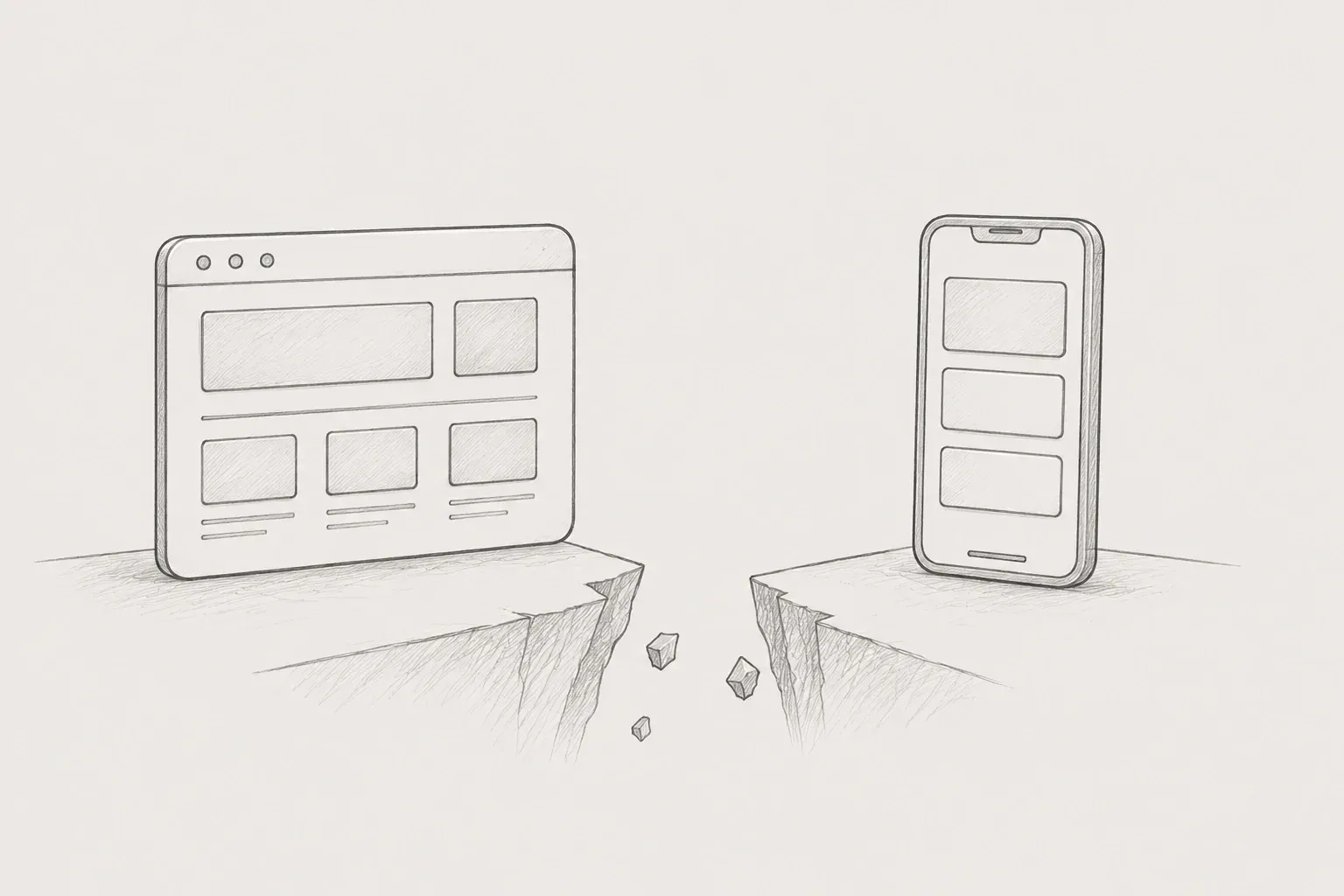
I have mainly been engaged in publishing work in a web environment. I have experience with responsive web work, but this is the first time I have built and implemented UI specifically in a mobile environment. Initially, I thought that mobile would not be much different since it is also based on web technologies. However, as I progressed with the work, I realized that mobile is not simply a smaller version of the web in many aspects.
In a mobile environment, various elements such as layout structure, user input methods, screen height calculations, scroll handling, and accessibility responses all had to be considered together. In particular, methods that were used naturally in the web often did not apply directly to mobile, making it a continual learning process for new standards.
The first difference I felt in mobile was the user input method. In a web environment, interactions utilizing hover states are very common because they are mouse-based.
.button:hover{
background-color: #f5f5f5;
}
The hover state provides visual feedback when the user hovers over an element, making it an important interaction element in desktop UIs. However, in a mobile environment, there is no mouse, and all input is based on touch. As a result, the hover state either does not work at all or only works in a limited fashion on mobile. Therefore, it is common to design the UI based on active states or selected states rather than hover-centric interactions in mobile.
.button:active{
background-color: #f5f5f5;
}
Through this difference, I confirmed that even with the same UI, state design can vary significantly depending on the input method. It was important to understand that it is not merely a matter of changing styles but requires redefining UI states based on user behavior itself.
I also experienced similar differences with checkboxes and radio buttons. In a web environment, it is possible to use small control elements by clicking directly, but in mobile, touch accuracy is a crucial factor. Since users operate with their fingers on mobile, if the clickable area is not sufficient, usability can drop sharply. In particular, when only small UI elements like checkboxes are made clickable, the likelihood of malfunction increases. To solve this issue, a method is used to configure checkboxes and labels as a single clickable area.
<FormControlLabel
 control={<Checkbox />}
 label="자동 로그인"
/>
This structure also allows for selecting text areas along with checkboxes, effectively expanding the touch area. As a result, users can perform the same action through a wider area, which improves both UI accuracy and usability.
Handling mobile UI, the Bottom Sheet structure was also one of the important patterns. The Bottom Sheet is a panel UI that comes up from the bottom of the screen, frequently used in mobile environments.
On the web, modals that are displayed in the center are generally common, but on mobile, the bottom of the screen is evaluated as the area with the best finger accessibility. For this reason, functions such as option selection, filters, input forms, and file uploads are often provided in the form of Bottom Sheets.
Additionally, because the Bottom Sheet can provide functionality without fully transitioning the screen, it allows users to perform additional actions while maintaining the current context. This is a very important factor in mobile UX.
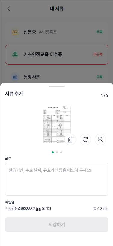
<Bottom Sheet image used in the Project Manager's notes>
During the layout implementation process, the concept of Safe Area also played an important role. Recent mobile devices typically use the entire screen, and as a result, there are physical UI areas at the top and bottom.
At the top, there is a notch area where the camera and sensors are located, and at the bottom, there is a home indicator for home gestures. These areas are classified as regions where content should not directly intrude.
Therefore, in mobile UI, margin processing considering the Safe Area is essential.
.mobile-layout{
padding-top: var(--safe-area-top);
}
If the Safe Area is not considered, there can be issues where the content overlaps with the device UI, reducing readability or obscuring some content. This effect is even more pronounced in the iOS environment.
The way to handle screen height was also one of the important differences between web and mobile.
On the web, the overall screen height is generally configured in the following way.
html,
body,
#root{
height: 100%; // 또는 height: 100vh;
}
height: 100% is calculated based on the height of the parent element, while 100vh is calculated based on the viewport height. The viewport refers to the area of the screen that the user is currently viewing. In other words, it serves as the basis for the area that is actually visible on the screen. However, in a mobile environment, address bars and bottom bars dynamically appear and disappear, causing the actual usable screen height to constantly change. This can result in issues where 100vh does not accurately match the actual screen. To address this problem, it is now common to use the dvh (Dynamic Viewport Height) unit.
html,
body,
#root{
height: 100dvh;
}
Since dvh takes into account changes in the browser UI to calculate the actual usable screen height, it allows for a more stable layout composition in mobile environments. It plays an important role in reducing layout shaking, especially in layouts including scrollbars.
Scrolling action was also one of the important elements in mobile environments.
.mobile-content{
overflow-y: auto;
-webkit-overflow-scrolling: touch;
overscroll-behavior: contain;
}
In particular, -webkit-overflow-scrolling: touch is a property used to apply inertial scrolling in iOS environments. When this setting is applied, even if a user quickly scrolls and then releases their finger, a natural scrolling effect continues. It is an important setting to replicate the scrolling experience perceived in native apps within the web environment. The smoothness of scrolling in mobile UX has a direct impact on user experience, making it more than just a simple style property.
Font units have also been structurally changed with consideration for mobile environments. Initially, fonts were defined in the code as px units as defined in design tokens.
$fz-10: 10px;
$fz-11: 11px;
$fz-12: 12px;
…
px is an intuitive and easy-to-use unit, but it is an absolute unit. In mobile environments, user font sizes may change based on accessibility settings, so using relative units would be more appropriate.
In the project, utility functions were established to consistently convert various font sizes defined in design tokens to rem.
// rem 변환 함수 정의(Base size: 16px 기준)
@function rem($px) {
@return math.div($px, 16px) * 1rem;
}
$fz-10: rem(10px);
$fz-11: rem(11px);
$fz-12: rem(12px);
$fz-13: rem(13px);
…
This is not just a simple unit conversion but a structural approach aimed at maintaining consistency within a design-token-based style system.
The advantages are as follows.
First, while maintaining design tokens based on px, it is possible to unify usage in the actual code using rem units.
Second, the unit conversion logic is concentrated in one function, enhancing maintainability.
Third, it reduces the problem of accidentally writing incorrect unit calculations.
Fourth, it can flexibly respond to future changes in accessibility settings or base font changes.
There has been a significant change in the layout composition method.
On the web, it is common to set fixed heights for card or list elements.
.card{
height: 120px;
}
However, in mobile environments, the font size or content length may vary depending on user settings. Fixed heights can lead to text being cut off or layouts breaking. Therefore, on mobile, a structure that naturally expands based on padding and content flow is more suitable than fixed heights.
.card{
padding: 16px;
}
This method allows for more flexibility in responding to various screen sizes and content changes, and it provides a stable structure in terms of maintenance.
The biggest realization I had through this mobile publishing experience is that the mobile environment is not simply a scaled-down version of the web. Various elements such as input methods, layout structures, screen height calculations, scrolling behavior, and accessibility considerations must be taken into account, and it was confirmed that each of these elements directly impacts the user experience.
In the future, I want to expand my experience to implement a more stable and consistent UI considering various device environments.
KKAMJJING