
Introduction
During a recent project, we implemented various Form screens based on React Hook Form (RHF) and Material UI (MUI).
At the beginning of the project, we used to build common Field components to maintain consistency in the Form UI.
<Field.Text
  name="name"
  label="Name"
/>
Developers were able to quickly set up input fields in this manner, using only the common components without the need to directly connect React Hook Form and MUI.
In practice, the service provided various input components such as the following.
-
Field.Text
-
Field.Select
-
Field.Autocomplete
-
Field.DatePicker
-
Field.DateTimePicker
-
Field.Checkbox
Initially, we thought this structure was sufficiently effective in terms of development productivity and UI consistency.
However, as the project expanded and screen requirements diversified, the limitations of the existing structure began to gradually surface.
Limitations of a Monolithic Structure
The initial Field component handled all roles within a single component, including Label output, Validation processing, React Hook Form connection, and Input rendering.
Field
├─ FormLabel
├─ Controller
└─ Input Component
This structure was convenient to use in general input screens.
However, in actual services, complex forms of UI often appeared rather than simple input fields.
UI with a button next to the Input
A typical example is a UI where a button is placed next to the input field.
For example, functions like duplicate check, request for authentication number, and address search are implemented in the following form.
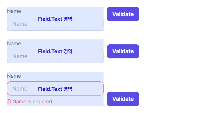
Since the existing Field.Text bundled Label, Input, and HelperText into one component, it was difficult to achieve the desired layout with simple Flex alignment.
-
Using align-items: flex-start aligns the Label and button at the same height.
-
Using align-items: center makes the vertical alignment of the Input and button awkward.
-
Using align-items: flex-end is fine in the default state, but when an error message is displayed, the button position shifts, and the alignment breaks.
Ultimately, hardcoding like margin-top: 22px was necessary to match the button position by calculating the height and spacing of the Label.
This was a case that showed the existing structure of Label, Input, and HelperText being too tightly coupled was not suitable for composing complex UIs.
The HelperText issue of Range Input (Range Field)
Another case was the range input UI.
Range input is viewed by the user as a single input item, but the actual implementation consists of two input fields for the start and end values.
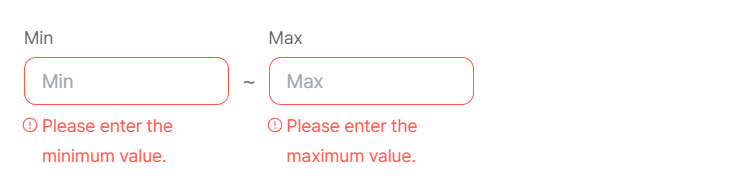
In the existing structure, each input field operated as an independent Field, so when a Validation Error occurred, the HelperText was also outputted individually.
Especially on narrow screens, there was a problem where error messages would wrap into multiple lines, significantly increasing the overall height.
Additionally, there was an issue where the layout height appeared unstable if the lengths of the start and end value error messages differed.
Users input a single value called "range," but the error messages being displayed as two separate parts was also disappointing from a UX perspective.
Occurrence of cases bypassing common components
As the project became more complex, it became difficult to meet requirements using only the existing Field component in some screens.
Eventually, in some screens, the approach shifted to using React Hook Form's Controller and MUI components directly without common components.
<Controller
  name="period"
  control={control}
  render={({ field }) => (
    <TextField {...field} />
  )}
/>
The occurrence of bypass implementations despite the existence of common components indicated a lack of extensibility of those components.
To solve this problem, we revisited the existing structure.
Reason for reviewing the Composition structure
The biggest problem with the existing structure was that a single component had too many responsibilities.
To address this, we reviewed React's Composition Pattern.
Composition is a way to structure UI by combining small, role-specific components instead of having one large component handle all functions.
A typical example is as follows.
<Card>
  <Card.Header />
  <Card.Body />
  <Card.Footer />
</Card>
Each component focuses solely on its role and can be freely combined into the needed form.
This structure is a pattern often used in Design Systems and has the advantage of high extensibility and reusability.
Separating Fields by Role
Previously, a single component was responsible for Label, Validation, connecting to the Form, and displaying Errors all at once.
This has been separated into roles as follows.
<Field>
  <Field.Label />
  <Field.Control />
  <Field.HelperText />
</Field>
Each component has the following responsibilities.
-
Field: Layout composition and common state management
-
Field.Label: Label output
-
Field.Control: Connecting to React Hook Form and rendering input elements
-
Field.HelperText: Displaying error messages and guidance text
By separating roles, the responsibilities of components have become clearer, allowing for much more flexible UI composition.
The biggest change: Field.Group
The most significant change in this refactoring is the introduction of Field.Group.
In actual services, multiple input elements often share one meaning.
A representative example is the date range selection UI.
<Field>
  <Field.Label required>
   기간
  </Field.Label>

  <Field.Group>
   <Field.Control name="startDate" />
   <span>~</span>
   <Field.Control name="endDate" />
  </Field.Group>

  <Field.HelperText />
</Field>
In the existing structure, since the start date and end date operated as independent fields, error messages were redundantly displayed, making it difficult to provide group-level UX.
On the other hand, since the introduction of Field.Group, it has become possible to manage multiple input elements as a single field unit, and both layout and validation processing can be composed much more naturally.
Scalability brought by the composition structure
Since the introduction of the composition structure, there has been almost no need to create separate dedicated components even when new requirements arise.
For example, the tag input UI can also be implemented by combining existing components.
<Field>
  <Field.Label>
    Tags
  </Field.Label>

  <Field.Control
    render={() => (
      <>
        <TextField />
        <ChipList />
      </>
    )}
  />

  <Field.HelperText />
</Field>
In this way, instead of continuously adding components for new features, it has become possible to implement various UIs by combining existing components.
Application results
After applying the composition structure, we were able to achieve the following effects.
-
Ensuring consistency in Form UI structure
-
Improved capability to handle complex input UIs
-
Ease of adding new input types
-
Increased utility of MUI slotProps
-
Reduced circumvention of common component implementation
-
Reduced maintenance costs
-
Enhanced reusability
In particular, the scalability has significantly improved as it has become possible to solve issues through composition rather than modifying existing components even when new requirements arise.
In conclusion
Initially, I thought it was just a task to improve the React Hook Form wrapper component.
But in reality, the more important issue was considering "how to design common components for long-term scalability".
Through this experience, I confirmed that the Composition approach, which separates responsibilities and allows for combining necessary functions, is much more flexible than the Monolithic approach of adding all features to a single component.
In the future, I plan to apply this design approach not only to the Form component but also to the overall Design System to enhance reusability and scalability.
nature