
A Screen for Strangers
The Banjang Note I’m currently working on is not an app used only by people belonging to a specific organization. It targets day laborers and team leaders working at semiconductor construction sites. These are people who recruit workers on-site and look for jobs when they want to work. They belong to a somewhat unfamiliar field with which I have had almost no contact. That is why I felt a certain sense of uncertainty from the moment I started building this app.
When creating software for professionals, you can design the screens on the assumption that users already understand the context of their work. But it is difficult to carry that assumption over to Banjang Note as it is. Rather than making assumptions in advance about the users’ age range or smartphone proficiency, it means looking more closely at which parts might feel unfamiliar when they first encounter the screen. Designing screens without assuming that users already know what to do is a bigger difference than it may seem. That is because the very types of things you need to consider when creating a screen change.
The Anxiety of Wondering Whether They’ll Understand
So a subtle anxiety follows me whenever I create a screen. Will users immediately know what will happen when they press this button? Will they be confused about what to do next after reading this text? Could this word feel unfamiliar to them? I find myself continually asking myself questions like these.
For example, I spent a lot of time deciding on even a single placeholder for an input field. I considered whether to use different instructions depending on the nature of the field: “Please enter ~” for text fields, “Please select ~” for selection fields, and “Please enter numbers only” for fields that accept only numbers. It may seem trivial from the user’s perspective, but I believed this was where the difference lay between immediately knowing what to enter in a field and not knowing. Using the single word “Enter” everywhere would be convenient, but I thought that users might try entering text in a field that accepts only numbers and encounter an error.
In particular, when designing the UI, I found myself reconsidering each time whether I could apply familiar design conventions as they were—for example, assuming that users would intuitively understand something as long as it had an icon, or that people are familiar with this level of interaction because everyone uses it these days. These instincts are naturally acquired by using smartphones and various apps every day, but they do not necessarily match the instincts of the target users.
This anxiety was not actually a bad thing. On the contrary, it made me think once more from the user’s perspective whenever I created a screen. Rather than assuming that users would be inexperienced with smartphones or apps, I kept reminding myself that users knew far more than I did about the work and screen flows handled by this app, while I was the unfamiliar one in this domain. As a result, I naturally began to reduce my own assumptions that users would obviously know this much. And through that process, I found a direction: write in a helpful way, and naturally guide users toward their next action. I wanted to use copy to guide users so they would not pause when looking at the screen or have to figure out for themselves what to do next.
But the feedback I received was the exact opposite
The problem came next. I received feedback asking me to use the most concise wording possible for button labels. I wanted to write in a helpful, explanatory way, but what was actually requested was short and definitive wording. For example, at first I wrote button labels in a tone that gently encouraged the next action, using wording like “Go to log in.” Since pressing the button did not actually complete the login but instead moved the user into the login process, I thought it was more appropriate to use wording that conveyed the nuance of moving somewhere, such as “Go to ~,” rather than the noun form “Login.”
But the feedback was to shorten it to something like “Login.” At first, I worried that if it was too short, it might feel too stiff and cold, or that users might be confused about whether pressing it would log them in immediately or take them to the login page. This feedback pointed in a different direction from the helpfulness I had envisioned. I had equated being helpful with adding enough explanation, but at that moment I had not realized that, in the context of a button, this could actually be counterproductive.
I received similar feedback about the home screen. I had added a greeting at the top saying something like, “Hello, user~ Take care today, too!” but was told that this kind of message was unnecessary. In fact, I had thought it was an element that naturally belonged there because greetings like this are a common pattern in many apps. Addressing users by name and greeting them can make them feel that the app recognizes them and create a sense of familiarity, as if one person were speaking to another. That is probably why such greetings are often used early in a service to soften the tone and make the app feel less unfamiliar.
But for Banjang Note users, this greeting could feel like decoration unrelated to the purpose of using the app. People generally open Banjang Note when they are looking for a place to work that day, checking the status of an application, or urgently trying to find workers. Placing a greeting before that means adding one more step before they can reach the information they actually need. This feedback made me reconsider how copy intended to create familiarity could instead move users one step farther from their goal.
Looking back, the reasons were similar for both the button labels and the greeting. A button is an element that users need to recognize and press immediately during the brief moment they scan the screen. If a sentence inside a button becomes long, it takes longer to read, and as the time their gaze remains on it increases, users may hesitate and wonder, “Is it okay to press this button?” The same applies to greetings: every time you add a message that is not essential to the screen, you increase the distance users must travel to reach the information they are actually looking for. It was only after receiving this feedback that I truly realized helpfulness does not always mean adding even one more line of copy.
So I found a compromise
In the end, I concluded that buttons should be concise, while places that require explanation should provide clear and genuinely helpful guidance. A button only needs to tell users briefly and clearly what action they are taking now. For example: “Confirm,” “Delete,” or “Next.” Without unnecessary wording, users should be able to understand the meaning as soon as their eyes land on it. I came to accept that, in this context, trying to soften the ending or explain the situation could actually get in the way.
Instead, in areas that require explanation—such as onboarding screens, guidance copy, and empty states—I wrote as simply and warmly as possible. For example, on an empty screen with no data yet, I paired a message explaining the situation, such as “There are no active job postings. Register a job posting now!”, with an action button. This guided users so they would not have to decide for themselves what to do next. Since these are places where users can take the time to read, I decided that it was better to be sufficiently helpful here.
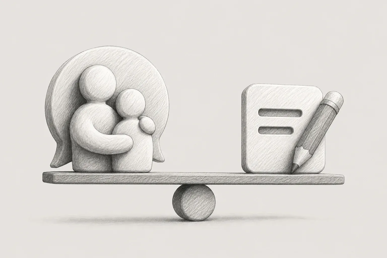
Once I divided the roles this way, I was able to strike a balance in which the buttons became clear and the overall screen remained helpful. I learned that rather than forcing every piece of copy into a single tone, I should vary the tone according to the role each element plays on the screen.
My UX Writing Principles from This Experience
After going through this experience, I developed several principles to use when writing copy.
1. The form helpfulness takes differs depending on the context. A place that requires immediate judgment, such as a button, and a place where users can take time to read, such as onboarding or instructional text, should express helpfulness in different ways. For the former, being brief and clear is helpful; for the latter, providing enough explanation is helpful. Rather than forcing the same tone across the entire screen, I found that adapting it was actually a way of considering the user.
2. The goal is to keep users from having to “think.” Helpful copy is copy that does not make users stop and deliberate in front of the screen. It is not about adding lots of explanation, but about ensuring that users do not have to infer what to do next on their own. I learned that helpfulness should be judged not by the length of a sentence, but by the size of the hesitation users feel.
3. Do not equate familiar instincts with the user’s instincts. As a designer, being exposed to many apps every day gives you the sense that users will obviously know this much. But that sense comes from your own experience, not from the experience of the target users. The less contact you have with a user group, the more you need to question once again the things that feel obvious to you.
4. Reduce repetition and meaningless copy. When you lengthen sentences with the intention of writing helpfully, you may find upon rereading them that you are saying the same thing twice. Providing sufficient explanation and repeating the same idea are different, but that distinction is not always easy to see while writing. The same applies to copy that merely adds tone, such as a greeting, without being related to the purpose of the screen. It may soften the atmosphere, but if users can understand and use the screen without it, there is no reason to include it. After writing all the copy, I felt the need to develop a habit of reading it aloud and checking whether the latter sentence repeats something the previous sentence has already said, and whether deleting the copy would cause users any problems when using the screen.
5. Distinguish between everyday terms and terms that require learning. When deciding which words to use in copy, I first try to determine whether a word is something users already use in everyday life or something used only within this app or type of work that might feel unfamiliar when encountered for the first time. In the latter case, rather than using the word as-is on the screen, I chose to explain it in plain language or add a brief explanation at the first point of contact, such as onboarding or a tooltip. Conversely, I also learned that unnecessarily spelling out words users already know only makes the sentence longer and more awkward.
Another thing I learned is that a single button label can affect development effort and layout stability. After experiencing this firsthand, I realized that copy is not a matter of the designer’s personal preference, but the result of collaboration and alignment with developers and publishers. I also learned that the sense of bewilderment I felt when I first received the feedback “Please keep it concise” was not actually a matter of clashing preferences. It reflected a difference in perspective: the same goal needed to be interpreted differently depending on the context. Rather than reacting defensively to feedback, I learned that it is important to first understand the context and reasons behind it.
In the end, UX writing was about removing myself from the equation
When button labels become longer, the development side immediately faces more exception cases, while the publishing side runs into problems such as line breaks or broken button dimensions. Once I realized that a sentence lengthened because I wanted to write “helpfully” could affect the work of other roles, I understood that the feedback to keep button labels concise was not a matter of taste. It was closer to a minimum rule that must be followed on screens handled collaboratively by multiple disciplines.
Looking back, my desire to become good at UX writing began with the pressure of feeling that I had to make users understand. But what was actually needed was not writing helpfully in my own way, but developing the sense to distinguish the appropriate tone for each screen and element. It meant acknowledging that buttons have the role of buttons and explanatory copy has the role of explanatory copy. The standard for defining those roles should not be my personal preference, but what users actually need on that screen.
Eykim